Wednesday, June 5, 2019

2019-2020 Winter Forecast Release Dates

For the 2019-2020 winter, I will be publishing two outlooks: a Preliminary winter forecast, as well an Official winter forecast. There will not be a Final winter forecast.

The Preliminary 2019-2020 Winter Forecast will be published on August 17, 2019 at 12:00 PM Central Time (1:00 PM Eastern Time).

The Official 2019-2020 Winter Forecast will be published on October 12, 2019 at 12:00 PM Central Time (1:00 PM Eastern Time).

Of course, these dates will be brought up over the course of the summer and early fall: this will not be the only time the release dates are published & talked about. Hope to see you there!


Andrew

Positive QBO Set to Strengthen Polar Vortex in Winter 2019-2020

The emergence of a strong positive-QBO state in the stratosphere in recent months looks set to persist into the coming winter, with a likelihood of a stronger-than-normal stratospheric polar vortex as a consequence. This, of course, will feed into the broader winter outlook for the United States as a result. Click any image to enlarge it.

---

As a side note, thank you to all of those who sent well-wishes for my wisdom teeth surgery the other day! The surgery went very smoothly and the recovery has been remarkably painless, which lets me get back to writing these posts quicker!

---

Of course, before we dive into the juicy stuff, we need to first briefly review what the QBO phenomenon is.

The Quasi-Biennial Oscillation, or QBO, in a nutshell measures the direction of winds in the stratosphere located over the equatorial regions. The QBO has two phases: a positive phase and a negative phase.
In the positive phase of the QBO, stratospheric winds over the equator are westerly (from the west, to the east). This has the effect of strengthening these "westerlies" in the stratosphere in the upper latitudes of the Northern Hemisphere, in this case promoting a stronger polar vortex as the stronger westerlies strengthen the vortex.
The negative phase of the QBO sees these stratospheric winds over the equator turn easterly (from the east, to the west), which has the effect of slowing down the westerly flow in the stratosphere of the upper-latitudes of the Northern Hemisphere. Consequentially, this weakens the stratospheric polar vortex, all else equal.

Let's take a look at the recent history of the QBO to see what we're working with heading into the summer and fall months.

Screenshot of recent wind values to illustrate the QBO. Positive (negative) QBO wind values are shown in gray (white) shaded areas.
Source of screenshot: Free University of Berlin
Source of annotations: Author
The QBO is readily seen in this time-series view of stratospheric wind values and directions over the Equator, with the positive phases of the oscillation laid out in gray shading and the negative phase shown in white shading.

I've annotated this image to point out the recent emergence of westerlies over the Equator, displayed on the screenshot by the swath of gray shading and positive contour values. As of the latest observations, the westerlies had propagated down to about the 70-millibar level over the Equator, meaning this wave of westerly winds is well on its way and we are firmly entrenched in a positive QBO regime.

Of course, this has notable implications for the coming winter. As this blog has discussed extensively in previous winters, the stratosphere can be used to glean extensive information about the broader forecast, whether on a scale of days or months. In this case, to identify what a positive QBO winter may entail (holding all else equal, of course), I've gone through the Climate Prediction Center's 30-millibar dataset of equatorial stratospheric wind speeds and direction and sorted each calendar month in a descending order. Then, for the three primary winter months (December, January and February), I pulled the years of the five strongest positive QBO values for each month. Given that the QBO is a prolonged oscillation (whereas something like the North Atlantic Oscillation changes in a matter of days), this method pulled out only eight distinct winters. I then created composite images of different atmospheric variables during the winter months for these eight years to give an idea of what a positive QBO environment generally entails.

First, let's see what a 'typical' positive QBO brings in terms of the Northern Hemisphere's stratosphere.

50-millibar geopotential height anomalies over the Northern Hemisphere for the December-February periods of eight positive-QBO winters (with the year of the LAST month in the DJF period shown).
Source: ESRL
As the above image shows, the aforementioned strategy produced the winters of 2016-2017, 2013-2014, 2015-2016, 2010-2011, 1990-1991, 1982-1983, 2008-2009 and 1992-1993, in no particular order. I first produced a graphic showing the geopotential height anomalies over the Northern Hemisphere for those winters at the 50-millibar level, right about at the mid-section of the stratosphere. This level was chosen to give a more-arbitrary view of the stratospheric polar vortex, as there can be issues preferring to look at the 100-millibar level as well as the 10-millibar level.

Creating this composite image confirms the explanation given to what happens in a positive QBO environment: the stratospheric polar vortex in the Northern Hemisphere strengthens. Indeed, the strong negative anomalies centered over the Arctic Circle in this composite show the enhanced westerlies providing strength to the polar vortex, thereby keeping the cold air locked up in the Arctic. It's no wonder that those who enjoy winter weather are firmly in favor of the negative phase of the QBO!

Next, I took these same years but changed the height level of the atmosphere from 50 millibars to 500 millibars.

500-millibar geopotential height anomalies over the Northern Hemisphere for the December-February periods of eight positive-QBO winters (with the year of the LAST month in the DJF period shown).
Source: ESRL
The story isn't too different when moving down to the 500-millibar level, which is where meteorologists look to identify the features that more directly impact you and me. For example, warmer colors on this map illustrate ridges of high pressure, while cooler colors identify low pressure areas. Given the stronger polar vortex, it's therefore not a surprise to see a swath of below-normal height anomalies extending from Greenland into Canada, symptomatic of a relatively-stronger tropospheric polar vortex.

I do want to briefly discuss another feature here, however, and that's the extreme positive height anomalies in the Bering Sea. A sharp-eyed weather enthusiast may recognize that swath of well-above-normal geopotential heights as an almost-textbook negative phase of the West Pacific Oscillation, or WPO. In contrast to the QBO, which records changes in terms of months, the WPO changes on a daily basis, making it more useful for daily & weekly forecasts as opposed to seasonal forecasts. Still, this is important, and especially-so for fans of winter weather.

Composite image of 500-millibar geopotential height anomalies (top panel) and surface temperature anomalies (bottom panel) in the positive phase of the West Pacific Oscillation.
Source: ESRL
The composite image above shows what typically happens when the WPO is positive, so for our discussion of the *negative* phase, simply view the anomalies as opposite for a rough idea of what a negative WPO entails. All else equal, the negative phase of the West Pacific Oscillation involves a strong ridge over the Bering Sea, like what was shown in the positive-QBO composite image right above this. That strong ridge tends to try and force itself further north into the Arctic Circle, which then pushes the jet stream further north. As a consequence, downstream of that ridge, a trough over Canada is coerced into shifting south and even a little west, not dissimilar to what the positive-QBO composite image shows with negative anomalies in southwest Canada extending into the Pacific Northwest. This then can encourage a ridge to build in the eastern U.S., however, which prohibits the cold air from making it too far east.

In other words, the positive phase of the QBO tends to create a strong ridge in the Bering Sea, holding all other variables equal, in a pattern that is then classified as the negative phase of the WPO. These two oscillations may be different in definition but their impact on the contiguous United States is similar: colder and stormier weather in the West U.S., the potential for a ridge in the eastern or southeastern U.S., and the threat for storm systems to ride the jet stream northeast across the Plains into the Midwest and Great Lakes.

Let's see if that explanation holds up to the 'typical' surface temperature anomalies in a positive QBO event.

Surface temperature anomalies over North America for the December-February periods of eight positive-QBO winters (with the year of the LAST month in the DJF period shown).
Source: ESRL
The surface temperature anomalies in positive-QBO environments does seem to match up with what was described immediately prior. In these winters with a positive QBO, colder than normal temperatures are more predominant in the northern third of the country, maximized in the North Plains and northern Rockies into western Canada. Conversely, warmer-than-normal temperature anomalies tend to be more likely in the southern third of the country, with a particular preference for warmer temperatures along the East Coast as that ridge I mentioned seems to try and make an appearance.

250-millibar vector wind anomalies over North America for the December-February periods of eight positive-QBO winters (with the year of the LAST month in the DJF period shown).
Source: ESRL
Just to push the point home a bit more, above is a composite image of vector wind anomalies over North America at the 250-millibar level (roughly the jet stream) for those eight positive-QBO winters. In other words, this gives an idea of how the jet stream is oriented during winters with a positive QBO, all else equal.

In a positive QBO winter, we tend to see the strong ridge over the Bering Sea force the Pacific jet stream to the north, as previously discussed, before it buckles south as it crashes into North America. From there, things get a little tricky. It seems plausible that the jet stream oriented in this fashion wouldn't be sufficient enough to pull storm systems into the Southwest (not as an overarching theme, at least), but would be sufficient to likely come onshore somewhere in northern California or Oregon and then ride a rather-zonal path to the east before turning northeast somewhere over the Plains. This kind of storm track would keep the Northern Plains most pointedly under the gun for winter weather threats, but the hint of a subtropical jet stream along the Gulf Coast suggests this storm track would not necessarily be the only track. That's a positive thing for those in the East U.S. who are hoping for a snowy winter.

To Summarize:
- The Quasi-Biennial Oscillation (QBO) is currently in its positive phase, and is likely to remain this way into the coming winter.
- Typically, a positive-QBO winter brings cooler than normal conditions to the northern third of the country and warmer conditions to the southern third and East Coast.
- A positive QBO also seems prone to supporting a negative-WPO state.
- Most importantly, however, a positive QBO supports a stronger stratospheric polar vortex, which restricts the flow of cold air to lower latitudes.
- As such, a positive QBO this winter may temper the likelihood of colder than normal conditions for the United States as a whole.

Andrew

Tuesday, May 28, 2019

ENSO Analysis and Outlook: Fall into Winter 2019

This post will analyze the current state of the El Nino-Southern Oscillation (ENSO) phenomenon as well as forecasts for its nature through fall 2019 and into the early winter months of 2019. It is critical to note right off the bat that this is *not* an ENSO forecast for the winter of 2019-2020, but the forecast period we will be going over will tread into November and December. Click on any image to enlarge it.

We will first define what the ENSO phenomenon is, and why we care about it.

Graphical depiction of the four different ENSO monitoring areas.
Source: Climate Prediction Center
The ENSO phenomenon, in a nutshell, is a primary driver of seasonal (and, through other shorter-term oscillations, weekly or even daily) weather patterns by way of sea surface temperature (SST) anomalies in the waters across the Equatorial Pacific. When these sea surface temperatures are above normal, we call it an 'El Nino' event. When these anomalies are below-normal, we call it a 'La Nina' event. While we monitor the entire Equatorial Pacific to analyze the ENSO phenomenon, there are four primary "zones" through which to observe. They are:


  • Nino 1+2. This is a small slice of the Pacific located between the Equator and the 10º South latitude line, extending from the far western tip of Peru to the 90º West longitude line.
  • Nino 3. This is a larger slice of the Equatorial Pacific which spans from 5º North to 5º South latitude lines, and from 90º West to 150º West longitude lines.
  • Nino 4. This is also a larger slice, and also extends between 5ºN and 5ºS on the latitude markers. For Nino 4, however, the space is spread by longitude from 150º West to about 160º East, crossing the dateline in the process.
  • Nino 3.4. This is the critical area to watch, and is typically viewed as the primary space with which to assess the state of the ENSO phenomenon. Spatially, it extends from 5ºN-5ºS latitudinally, and 120º West to 165º West longitudinally. 

Why do we break this space up into four different pieces rather than just average out the sea surface temperature anomalies and call it a day? A number of scientists with far more knowledge and research than I have come to determine that there can be more than one type of El Nino - where typically El Nino's bring warmer than normal waters to the eastern Pacific, an "El Nino Modoki" event brings warm waters to the western Pacific, and cooler waters to the eastern Pacific. This is not a trivial difference, but for our purposes here, we won't dive into that topic. For now, the key is understanding there are four different regions in which we monitor the ENSO phenomenon, with the Nino 3.4 region broadly being of most importance.

Let's view sea surface temperature anomalies over the Pacific now, with a focus on those regions that were just outlined.

Observed sea surface temperature anomalies on May 20th, centered over the Equatorial Pacific.
Source: NOAA
As of May 20th, sea surface temperature anomalies along the Equatorial Pacific were, on the whole, above normal. A solid swath of above-normal anomalies extended across Oceania to about the 130º West longitude line. From there to about the 110º West longitude line, however, SST anomalies were seen closer to zero, with a very small area of slightly below-normal temperature anomalies. We'll get in to why that's there in a little bit. By the 100º West line of longitude, however, solidly above-normal sea surface temperature anomalies return to the western tip of Peru.

Based on what was discussed earlier, this seems to point towards the presence of an El Nino event (the positive state of the ENSO phenomenon). To confirm or reject this, the Earth System Research Laboratory (ESRL) has composed a Multivariate ENSO Index (MEI) to quantify the state of the ENSO phenomenon, as shown below.

MEI, showing positive (El Nino) and negative (La Nina) changes to the ENSO phenomenon.
Source: ESRL
The MEI aims to determine if there is an El Nino in place (via positive index values), if there is a La Nina in place (via negative index values), or if there is a neutral-ENSO state (via index values equal to zero). You can identify a few extreme events on here, such as the strong El Nino in 1997 and the substantial La Nina event in 2010. Looking to the last several data points, it appears that there has been a general trend towards an El Nino event, but nothing particularly steady is in place.

I say nothing steady is in place because, as a general rule of thumb, an El Nino (La Nina) is present if sea surface temperature anomalies are above-normal by at least +0.5 degrees Celsius (below-normal by at least -0.5 degrees Celsius). If SST anomalies are positive but just barely so, it's technically a neutral-ENSO state, but clearly there's a better shot at an El Nino forming down the line. The same logic applies to SST anomalies that are negative but just barely so, with respect to a La Nina.

As of May 9th, the Climate Prediction Center continued its El Nino Advisory (click here for full briefing), which indicates that an El Nino event is ongoing. Indeed, the agency assigns a 70% probability of an El Nino continuing through the summer months, with a 55-60% chance of the El Nino persisting through the fall months. These probabilities may seem rather low given that the El Nino is actually occurring already, but as the rest of this post will show, it isn't that cut-and-dry with the ENSO phenomenon.

SST anomalies for each of the ENSO regions.
Source: CPC
Since we've already learned about the four different ENSO regions, it's time to apply that to observed data. Shown above are four panels of SST anomaly data over the past twelve months, with each panel corresponding to a different ENSO region. The top panel shows SST anomalies for the Nino 4 region; the second-from-top panel for the Nino 3.4 region; the second-from-bottom panel for the Nino 3 region; and the bottom panel for the Nino 1+2 region. In the aggregate, the data confirm that we are in an El Nino event, at least judging by sea surface temperature anomalies, with anomalies exceeding the +0.5º Celsius threshold in the Nino 4 and Nino 3.4 regions, with anomalies in the Nino 3 region right around that threshold. In contrast, the Nino 1+2 region has reversed to marginally-negative SST anomalies. This likely owes to the weak but broad area of slightly below-normal anomalies immediately southwest of the westernmost tip of Peru back on that observed SST anomaly graphic. Since it isn't a significant deviation, I don't see any major reason to raise concern over the difference in Nino 1+2 with the other three regions.

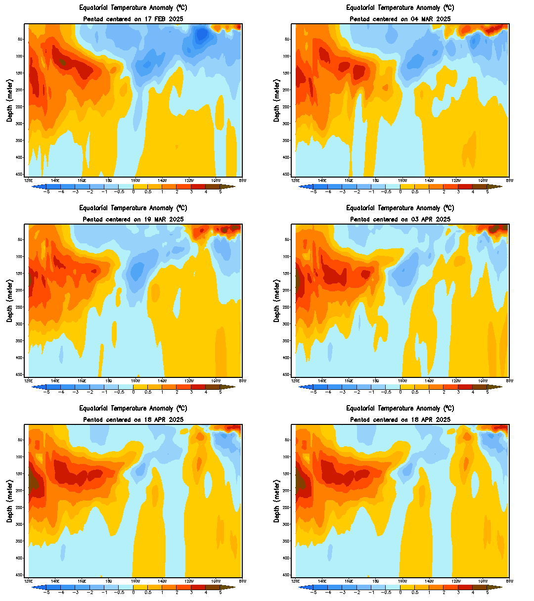
We are also able to look at sea temperature anomalies with varying depth along the Equator in the Pacific, as shown below.

Equatorial temperature anomalies (top) and observed nominal temperatures (bottom) as of May 18th.
Source: CPC
Viewing sea temperature anomalies along the Equator as a function of depth can prove massively beneficial to forecasting abilities, as it can enable the forecaster to identify an area of well-below-normal anomalies right below the surface that is eating away at above-normal SSTs on the surface. In this hypothetical, someone only viewing the surface map would think there's a solid El Nino in place, but the forecaster with the depth map as well can see that the El Nino is actually about to dissolve.

Turning back to actual data, the depth chart above shows a broad expanse of above-normal water temperatures extending from 140º East to about 120º West longitudinally, with the positive anomalies reaching a depth of almost 150 meters in the western portion of this swath. However, when reaching the 120º-100º West longitude area, well-below-normal temperature anomalies appear, and seem to be threatening the warmer anomalies located at the surface. We can view an animation of this depth map to see how these two opposing bodies of water have been interacting lately.

Sea temperature anomalies by depth, animated. Refresh the page if the animation stops looping.
Source: CPC
Indeed, when viewing the animation we are able to grasp the rather-dire situation the ongoing El Nino seems to be in. After covering almost the entire Equatorial Pacific with well-above-normal temperature anomalies from the surface to almost 150 meters down in March, cooler than normal waters have gradually grown between 150 meters and 250 meters below the surface since then and have materially weakened the formerly-stout positive temperature anomalies below the surface. Even more concerningly for the El Nino, the negative temperature anomalies appear to be growing and deepening east of the 120º West line of longitude, suggesting that the positive SST anomalies in that vicinity may be at risk of dissolving in coming weeks.

We have the ability to determine if this is likely to happen.

Equatorial Pacific upper-ocean (through 300 meters) heat anomalies over the last year.
Source of graphic: CPC
Source of annotations: Author
El Nino and La Nina events can be driven by Equatorial Kelvin Waves, and whether the wave moving eastward along the Equatorial Pacific is upwelling or downwelling. If that sentence made you raise an eyebrow, you're most likely not alone. I can assure you, though it's actually pretty simple to understand. Let's break it down.

The phrase 'Equatorial Kelvin Wave' seems intimidating, so for our purposes here all we need to know is that, from time to time, these Equatorial Kelvin waves develop in the western part of the Equatorial Pacific and gradually move eastward along the Equator. When they move eastward along the Equator, they can be either 'downwelling' or 'upwelling' waves.
Consider the explanation of a 'downwelling' Equatorial Kelvin wave as described by the NOAA (read the full article here):

"Normally, winds blow from east to west across the tropical Pacific, which piles up warm water in the western Pacific. A weakening of these winds starts the surface layer of water cascading eastward..."

In other words, if this wind pattern that blows winds from east to west breaks down, that warmer than normal water begins pushing eastward along the Equatorial Pacific. This anomalously warm water works its way eastward gradually and tends to sustain itself in the process. As a consequence, downwelling Equatorial Kelvin waves tend to be associated with El Nino events. You can see my annotations of downwelling Kelvin waves as solid lines on the above image.
On the flip side, an 'upwelling' Equatorial Kelvin wave can be thought of as the ocean waters trying to get itself a little more in balance in the wake of this very warm downwelling wave. Thus, an upwelling wave again features a Kelvin wave slowly progressing eastward, but this time it cools down the upper-ocean waters to a degree that upwelling Kelvin waves are generally associated more with La Nina events. In the above image, I've made an attempt to outline upwelling Kelvin waves by the dashed lines.

Given that we've had three clear downwelling Equatorial Kelvin waves traversing the Equatorial Pacific over the last year, as outlined on the above image, it's not necessarily a shock that we are in an El Nino at this time. In addition, we are able to use the above image to see that the emergence of cooler than normal water temperatures in the eastern equatorial Pacific appear to be the result of an upwelling equatorial Kelvin wave, as shown by the dashed line at around 110º West longitude.

I want to point out something that could endanger the El Nino by the time we reach late summer/early fall, however. Referring back to the above image, note how an area of cooler than normal water temperatures have developed between longitude lines 130º E and 160º E. I've circled this swath for two reasons: because it is a rather expansive area of cooler waters relative to previous below-normal anomalies in the other two more-apparent upwelling Kelvin wave episodes, and because it has brought about the strongest negative temperature anomalies in that portion of the equatorial Pacific in at least a year. The risk here is that this is the beginning of another upwelling equatorial Kelvin wave, which will move eastward with time and bring those below-normal temperature anomalies to the Nino regions. Should this occur (and it is not a certainty yet), it could endanger the El Nino, which is already in a more fragile position as a consequence of the existing sub-surface below-normal water temperature anomalies. We will have to monitor this in the coming weeks to see if it is indeed an upwelling Kelvin wave or merely an isolated area of cooler waters in the western equatorial Pacific.

As discussed, however, even if this is not an upwelling Kelvin wave beginning to form, there has been a material change in the ENSO phenomenon as of late that necessitates discussion.

Upper-ocean heat anomalies in degrees Celsius between 180º and 100º West longitude.
Source: CPC
The Climate Prediction Center has allowed us to compile those same anomalies shown in the previous image into a single graphic. This chart shows upper-ocean heat anomalies (in degrees Celsius) between the longitude lines of 180º and 100º West, from the surface to 300 meters down, if I recall correctly. In the presence of an El Nino, these anomalies should be positive, while a La Nina should bring these anomalies into negative territory.

During the month of May, we have seen a drastic shift in upper ocean heat anomalies, although in reality this shift began in mid-March. Indeed, after peaking at 1.5º C above-normal in the middle of March, those positive anomalies rapidly declined, to the point that they're now just barely in below-normal territory. The negative anomalies aren't strong enough to point to a La Nina, but the change from strongly positive values to marginally negative values is not a trivial one.

What does it mean? It's a good view of the evaporating above-normal temperature anomalies below the surface of the equatorial Pacific that we discussed earlier. The negative anomalies are likely a bit overdone and not reflective of the true nature of the ENSO phenomenon, given that there is a small yet significant area of below-normal anomalies around the 120º West line of longitude that is most likely distorting this graphic to the downside. As such, while the degradation in positive anomalies is accurate and noteworthy, the recent move into negative territory doesn't seem to be precise in my eyes.

Temperature anomalies between 2º North and 2º South latitude at the subsurface depths of 55 meters (left), 105 meters (center) and 155 meters (right).
Source: CPC
We are able to again see this material deterioration in the El Nino by looking at temperature anomalies along the Equatorial Pacific at three different depths: 55 meters, 105 meters and 155 meters below the surface. The 55-meter chart on the left shows the recent resurgence in below-normal temperature anomalies, erasing the above-normal anomalies that were in place as recently as late April. The 105-meter chart in the middle gives a better look at the underlying trend - indeed, steadfast positive temperature anomalies between 150º East and the dateline have deteriorated since late April, not to mention the elimination of well-above-normal anomalies centered around the 130º West line of longitude.
Perhaps most alarmingly for the viability of the El Nino, the positive temperature anomalies at a depth of 155 meters (right) have completely disappeared and have instead been replaced by marginally below-normal anomalies ever since late March. The lack of a solid underwater base for the El Nino does not bode well for its survival into fall and winter, especially if that aforementioned swath of colder than normal waters around the space between longitude lines 130º E and 160º E does turn out to be another upwelling Kelvin wave. Only time will tell, but this will certainly be something to watch as we move into the fall months.

We've analyzed a lot of observed data for the ENSO phenomenon, but scientists have put in a lot of hard work to create climate models that can anticipate the state of the phenomenon down the road. Let's take a look at these forecasts.

IRI/CPC suite of forecasts for SST anomalies in the Nino 3.4 region.
Source: IRI of Columbia University
There are two graphics of model guidance I want to go over. The first comes courtesy of Columbia University, and depicts a variety of weather models' forecast for sea surface temperature anomalies in the Nino 3.4 region from now until the January-February-March period of 2020. As stated at the start of this post, however we will only discuss forecasts going into November and December, as model guidance begins to diverge too much for my liking beyond that period.

Model guidance is in pretty good agreement on keeping the El Nino around through at least the August-September-October (ASO) period, with one or two outliers both to the upside and downside of the consensus. Beyond that period, however, divergence increases, although a general theme through the November-December-January period is that positive SST anomalies appear probable, especially relative to the potential for negative anomalies. It is worth making mention, however, of a cluster of models that prefer taking the Nino 3.4 SST anomalies into a level below +0.5º Celsius but above zero, a neutral-ENSO scenario. For now, though, we will side with guidance that prefers a weak El Nino through the fall months.

NMME suite of forecasts for SST anomalies in Nino region 3.4.
Source: CPC
The NMME suite incorporates many of the models used in the IRI/CPC suite, but is worth going over anyway because of its variance with the first contingent of models analyzed. While this group of models foresees the El Nino as likely to persist into August, it seems as though there is a higher chance of SST anomalies dipping into the 0.0º through +0.5º region, not high enough to merit an El Nino classification but again more likely to exhibit El Nino conditions as opposed to La Nina conditions. Beyond September, though guidance diverges too much to gather an accurate forecast.

To Summarize:
- An El Nino is currently in place, with an El Nino Advisory declared by the Climate Prediction Center.
- Recent sea temperature anomalies below the surface suggest the El Nino may be undergoing a material degradation, potentially posing a threat to the survival of the phenomenon through the fall and early winter.
- Despite the apparent threats to the El Nino, model guidance sees the El Nino continuing into the fall months and perhaps into early winter. Beyond then, however, guidance diverges too much to ascertain what will transpire into the heart of winter 2019-2020.

Andrew

Sunday, May 26, 2019

June 1-6 Potential Warming Trend

Model guidance is beginning to fixate on a broader trend away from cooler than normal temperatures in the central and east U.S. into a more seasonal, if not above-normal temperature pattern. Click on any image to enlarge it.

Forecasted 500 millibar geopotential height anomalies per the GEFS, valid 1pm June 1st.
Source: Tropical Tidbits
By June 1st, the GFS ensembles (GEFS) anticipate somewhat of a pattern change, albeit only to a modest degree, from the troughs continually dropping into the West, bowling east through the Plains and then shifting northeast through the Great Lakes. The ensembles here anticipate a trough to again drop into the Southwest, but this time mild ridging is projected to build into the Pacific Northwest as an upper level low migrates eastward from the Bering Sea into the Gulf of Alaska. Note that the ridge in the Pacific Northwest and southwestern portion of Canada will be tempered as the Pacific jet stream carves its way through west-central Canada, as opposed to carrying the trough down into the Southwest U.S.

Typical atmospheric pattern in a Rex Block pattern.
Source: National Weather Service
The result of this marginal shift in pattern is a Rex Block-like formation over the Western U.S. The image above shows a textbook Rex Block, where a ridge builds to force the jet stream northward, but an upper level low is positioned almost directly south of the ridge. The result downstream of the Rex Block is zonal flow, as shown by the almost-directly west-to-east isohypse alignment.

We see almost that same pattern in the GEFS forecast at the top of this post, with a ridge building into parts of the Pacific Northwest and southwest Canada, a trough to the south of that ridge, and zonal flow across the rest of the country as a result. Further, also seen in the textbook Rex Block image, we still see that stubborn upper level low positioned in southern Canada, the same feature responsible for repeated shots of cooler than normal air for swaths of the northern U.S. as of late. For the record, continued ridging over the North Pole affirms these bouts of cooler than normal weather will remain possible for the northern U.S.

Forecasted 850 millibar temperature anomalies as of 7am, June 4th.
Source: Tropical Tidbits
While the warming trend begins on June 1st as that zonal flow takes hold, the strongest above-normal temperature anomalies just a few thousand feet off the ground emerge on June 4th, with anomalies on a magnitude of 10 degrees Celsius above normal or higher forecasted by the GFS ensembles over parts of Oklahoma, Kansas, Nebraska and South Dakota. The entire Central U.S., parts of the Southeast and much of the Rockies look to be encompassed in these above-normal temperature anomalies before more seasonal weather begins to filter into the country's midsection.

After June 6th, model guidance begins to become more uncertain as to the direction of the pattern, but early indications are warmer-than-normal temperatures may sustain themselves in the Western U.S., leading to cooler than normal conditions for the eastern third of the country. I discuss the broad pattern outlook in a special long range outlook post here from last week, but already it appears that my early-June forecast may miss the mark for failing to catch this nascent warming trend.

To summarize:
- A warming trend is forecasted for portions of the Central and East U.S. beginning June 1st and continuing through June 6th.
- The warmest conditions look to be centered on the Plains, but temperatures gaining to at least seasonal levels appears likely from the Front Range in Colorado out into the Ohio Valley.
- Forecasts diverge beyond June 6th, but warmer than normal conditions may persist in the West while cooler conditions take over in the East.

Andrew

Friday, May 24, 2019

Special Long Range Outlook: Early to Mid June

This is a follow-up on my previous long range outlook posted last weekend (click here to read). In this post, I'll be using convective activity across the Equator as a basis for the forecast, and then consolidate that with the long range outlook previously published. Click on any image to enlarge it.

**If you do not wish to read this (admittedly technical) discussion, please scroll down until it says to stop.**

Let's first review the concept of the Madden-Julian Oscillation (MJO), as this will prove critical to the rest of this article. The MJO is an oscillation that is based on the location of convective activity along the Equator. Depending on where this convection is, the MJO is said to be in one of eight phases.

Portrayal of enhanced (suppressed) convection around the Equator, shown as green/blue (brown) colors, for each of the eight phases of the Madden Julian Oscillation.
Source: NOAA
In a generalized sense, Phase 1 of the MJO typically sees enhanced convection along the Equator from South America into portions of Africa. In Phase 2, this enhanced convection shifts east into the Arabian Sea and marginally into the Bay of Bengal, with storms most focused directly south of the subcontinent of India. Drier than normal conditions are then normally seen north and east of Australian into Oceania. Phase 3 again sees an eastward shift of enhanced convection, now firmly into the Bay of Bengal and the broader majority of the Indian Ocean, more focused on the eastern half of that body of water. Additionally, we see further strengthening of that convection, maximized just southeast of India. Phase 4 sees the enhanced convection move into the Timor Sea and Arafura Sea. By Phase 5, the convective activity begins entering the far western Pacific Ocean, with calmer than normal conditions developing in portions of the Indian Ocean. Australia also experiences the enhanced convective activity in Phase 5, mainly over the northern section of the country. Phase 6 shifts the enhanced convection further east, and so on through Phase 7 and Phase 8.

However, a number of scientists have put in long hours of hard work to focus in on how these areas of enhanced and depressed convection vary, if at all, in location and intensity depending on the time of year. The Bureau of Meteorology in Australia has created these composites over three-month windows - for our purposes, we will use the May-June-July window so as to be centered over June.

Portrayal of enhanced (suppressed) convection around the Equator, shown as cooler (warmer) colors, for each of the eight phases of the Madden Julian Oscillation during the May-June-July period.
Source: Bureau of Meteorology
 The location of areas of enhanced and suppressed convection are about the same as in the general composite graphic shown first. However, particularly in meteorology, more data and more accuracy is almost always a positive when making a forecast. As a consequence, I will refer to this image later on in this post, as opposed to the first image.

It's reasonable to be skeptical as to why we should care about the location and intensity of convective activity along the Equator. I can imagine some of you are wondering how some showers and thunderstorms thousands of miles from you and your computer screen can possibly have any substantial impact on the weather pattern, much less be a driver of the pattern as a whole. This article will aim to show why we care about the MJO, and how we are able to use those showers and thunderstorms to make reasonable forecasts for the United States almost a month in advance.

Now that we've reviewed what the MJO actually is and how we can determine which of the eight phases it is in, let's see which phase the MJO is currently in so we can begin building this outlook.

Madden-Julian Oscillation (MJO) phase space diagram forecast, from the ECMWF model and ensembles.
Source: Climate Prediction Center
The above graphic might appear intimidating, but in reality it's rather simple. The diagram itself is called a phase space diagram, and it uses two different mathematical models that analyze the concentration of clouds and the behavior of winds at different levels of the atmosphere to diagnose what phase the MJO is in, and how strong it is within that given phase. Those two different models are labeled RMM1 and RMM2, as shown by the 'x' and 'y' axes of the graph. In other words, they help create the graph to tell us what the MJO is doing.
Reading the graph is relatively simple. The eight different phases are clearly marked, with locations typed out at different parts of the chart to indicate where enhanced convection is located when the MJO is in a given phase. You can confirm this by comparing the phase numbers and location names to the composite image(s) discussed earlier in this article. The graph also gives an idea of the strength of the MJO - the further it is from the circle in the center, the stronger the MJO is within any given phase. If the MJO is shown to be in that middle circle, it means the oscillation is too weak to definitively assign a phase to, and thus may not be a primary driver of the atmospheric pattern at that time. Luckily for us, model guidance has the MJO as being outside of that middle circle for the entire forecast period.

Viewing this phase space diagram, we can see that the MJO was actually inside of that middle circle during the middle of April, just over a month ago. From there, however, the oscillation seemed to come to life and strengthened into Phase 2 by late April. From there, through May up to this point, enhanced convective activity propagated eastward from the Indian Ocean, bringing the MJO through phases 3 through 8, where it now sits. Indeed, the MJO has been positioned in phase 8 for about ten days now.

This particular set of model guidance, from the European model (the ECMWF) and its ensembles, sees the MJO shifting into Phase 1 to wrap up May, and then transitioning back to Phase 2 in time for early June. Indeed, this guidance even sees convection moving eastward enough to set up in Phase 3 by about June 6th, though at that point discrepancies among ensemble members begin to materially degrade the quality of the forecast, not to mention those members have the MJO wobbling close to that circle in the center.
Of course, there is more than just one model that tracks the MJO this way:

Madden-Julian Oscillation (MJO) phase space diagram forecast, from the CFS model and ensembles.
Source: Climate Prediction Center
This graph uses the same chart set-up and parameters as the one before, although this time instead of the ECMWF model and its ensembles, the CFS model and its ensembles are displayed. Even so, the CFS takes the MJO through almost an identical path as the ECMWF during the same time period, dragging the oscillation through Phases 1 and 2 to kick off June before trying to move towards Phase 3 by June 6th.

This concept of the MJO moving into Phase 2 to begin June, after traversing Phase 1 to close out May, is more-or-less the consensus forecast across available models. As such, we will incorporate a Phase 2 MJO state into this outlook for the first five days of June or so. Now that we know what the MJO should do for the first several days of June, what does that translate to in terms of the weather pattern here in the United States?

More hard work by scientists has allowed us to have answers to that question.

500 millibar geopotential height anomalies as observed during a Phase 2 MJO event in June.
Source: Japan Meteorological Agency
The Japan Meteorological Agency (JMA) not only narrows down the typical 500 millibar geopotential height anomalies, 2m temperature, 200mb wind speed etc. patterns that occur by MJO phase, but also divides these into individual months. As a result, we are able to view the typical 500 millibar height anomalies seen when the MJO enters Phase 2 during the month of June. In the top image, cooler (warmer) colors represent below-normal (above-normal) height anomalies, which generally correspond to troughs and colder weather (ridges and warmer weather). We don't need to really worry about the bottom panel; it shows the outgoing long wave radiation (OLR) anomalies for a Phase 2 MJO event in June. It might sound complicated, but it's really the same thing as analyzed in the first two graphics of this post: in that bottom panel, cooler (warmer) colors represent areas of enhanced (suppressed) convection. We already know from earlier that a Phase 2 MJO event corresponds to enhanced convection in the Indian Ocean region, and this bottom panel is just reiterating that.

Back to the top panel in this graphic, it appears that the MJO entering Phase 2 in the month of June tends to bring about stormier than normal activity in Russia and northeastern China, while maintaining a tendency towards ridging over Japan and southeast China. On the other side of the Pacific, a June Phase 2 MJO event encourages a ridge well offshore of the West Coast and southwest of the Gulf of Alaska, while stormier/cooler than normal activity is predominant in most of the Western U.S. Eagle-eyed readers will recognize the positioning of that stormier activity as corresponding to the negative phase of the Pacific-North American (PNA) index (you can read more about the PNA by clicking here). As such, it's not surprising that the Central and Eastern U.S. then experiences a tendency for ridging and warmer weather during this state of the MJO for the month of June.
In other words, when the MJO moves into Phase 2 during the month of June, the western U.S. tends to be stormier and cooler than normal, while the central and eastern U.S. will have a tendency in favor of ridging and generally warmer weather.

But wait a second - that sounds pretty familiar to the forecast I published this past weekend, with cooler weather in the West, warmer weather in the East and storms riding a ridge through the central part of the country, doesn't it?  That's not by coincidence - if you've followed this blog over the years, you'll find that these articles have often made these kinds of confirming conclusions between teleconnections and oscillations, enabling these long-range outlooks to have at least a bit of justification behind them as opposed to throwing darts in the dark. Whether that justification ever ends up being accurate, though, is always a question mark!

Indeed, long-range models see a pattern not dissimilar to that Phase 2 MJO composite evolving for the last bit of May and first bit of June:

Forecasted 500 millibar geopotential height anomalies from the ECMWF model (left), GFS model (center) and CMC model (right), all valid for the period from May 31st to June 2nd.
Source: Pennsylvania State University
Using these three models over the May 31 - June 2 forecast period, we can ascertain the general idea of troughing in the western U.S., signifying stormier weather, as well as a nascent ridge trying to form in the southern U.S. Note, however, that our forecast here seems to be scuttled by that large lobe of below-normal height anomalies and associated cooler weather in Canada. This seems to go right up against that MJO Phase 2 chart we were just looking at. What happened?

We have to go back to something I briefly touched on at the beginning of this post to understand why model guidance isn't showing what we expected. When analyzing the structure of the MJO phase space chart, I went over the circle in the middle, where an MJO phase can't be determined definitely because the oscillation is too weak at that point in time. Consequentially, the MJO may not be a primary driver of the pattern at that time. What we must now remember is that the MJO may not be a primary driver of the pattern at this time, even if it is in a defined phase. The atmosphere doesn't abide by any single oscillation or teleconnection, it is all one big puzzle.

In this case, models don't see North America getting a typical Phase 2 set-up because of Rossby waves sending much above-normal air into the Arctic Circle by way of those stout ridges over Eurasia and even potentially north of Japan. This forces the tropospheric polar vortex - already significantly weakened in the summer months, to be sure - to lower latitudes, as happens in the winter. Adding to that, we see a strong ridge positioned near Greenland (negative NAO pattern), which encourages cold weather in the upper latitudes to flow down to lower latitudes - in particular, the United States. These two factors (and likely more) combine to keep that swath of negative height anomalies locked out in Canada, bringing about that "unexpected" outcome. Additionally, during this forecast period, the MJO will be transitioning from Phase 1 to Phase 2, which makes it a little messy to use composite images. In any event, we now have three things to use in our forecast for early June:

- Phase 2 of the MJO
- Continuation of strong ridging over the Arctic Circle
- The negative phase of the North Atlantic Oscillation (NAO)

We'll make an actual forecast out of those factors at the end of this post. For now, let's move on to the mid-June outlook.

I'll begin by using another scary-looking chart which, in reality, isn't too tough to read.

Hovmoller of outgoing long wave radiation (OLR) between the latitudes of 5º North and 5º South, forecast period from May 22nd to June 19th, via the CFS model.
Source: North Carolina State University / Carl Schreck
First and foremost, let's break down what this chart shows.

For all areas above the solid black line positioned next to the May 22nd marker, all variables that will be described next are observed. For all areas below that solid black line, all variables are forecasted.
Next, we need to recognize that the solid colors here are merely showing the same thing we've looked at three times now: convective activity. As you might guess by now, green (brown) colors indicate the presence of enhanced (suppressed) convection.
The third thing to note about this chart is that we will not be paying attention to any of those red, pink and blue ovals and shapes - they indicate different types of waves and are juxtaposed with different bursts and drops in convective activity, depending on what kind of wave it is, but for our purposes we will disregard all that so it doesn't get too confusing.
The last thing to note about this chart so we can begin our forecast is that we do care about the black oval shapes. Remember back at the beginning of this post, when I explained that the MJO is an oscillation based on the location of enhanced convection along the Equator? Well, in this chart, those green areas show those same enhanced spots of convection at those same locations (see the longitude markers on the x axis) and also along the Equator (remember this chart shows convective activity between 5º North and 5º South latitude). The black ovals here are simply designed to highlight MJO waves (think of how the enhanced convection is a "wave" slowly moving east across the Indian and Pacific oceans).

That's about all that's critical to understanding that very-messy chart: knowing that part of the chart shows observed conditions and part of it shows forecasted conditions, knowing that the shaded colors show enhanced or suppressed areas of convection just like we've already gone over in other graphics, knowing that we can disregard the colored ovals and shapes, and knowing that the black ovals merely point out to you where the MJO wave is.

----

So, why do we care about it anyway? Whereas the forecasts of the MJO made using the phase space graphics only go out to June 6th, the CFS Hovmoller (name of this chart type) above goes out into late June, meaning we can use it for our mid-June outlook.

Let's start out at the June 5th marker on that chart. On June 5th, per this forecast, the MJO wave is forecasted to reach about the 85º East longitude region. If we refer back to the second graphic in this post, we can see that enhanced convection around 85ª - 90º East corresponds to the MJO being in Phase 2, nearing Phase 3. That lines up well with what the phase space forecasts anticipate by this time.

Beyond that, however, we run into some trouble. The forecast here has that convection, and the MJO wave as a whole, dissipating by June 12th, with the enhanced convection anomalies vanishing even before that, around June 10th. That poses a dilemma for us, as it means this model sees the MJO entering that center circle if we were to view this using a phase space diagram.

It seems like we're at the end of the road here. Of course, that's not the case.

Forecasted 200mb Velocity Potential for 1pm June 5th, using the GFS Ensembles.
Source: Tropical Tidbits
One way to identify the location of enhanced convection to track the MJO is by viewing anomalies in convective activity themselves, as we have done up to this point. Another way, however, is by viewing the upper air pattern to identify areas that are conducive for thunderstorm development. Recall that strong thunderstorms will build near the surface as air converges and rises, with the clouds of that storm then plateauing and spreading out high up in the sky when the air in those clouds becomes as cool as the environment, leading to the air high up in the sky to spread out and diverge. This is essentially what we're looking at here, only in this chart we're looking at those convergence/divergence motions only at the 200 millibar level (cruising altitude for most airplanes).
Green shading and associated spreading-outwards arrows indicates divergence aloft. This is a plus for thunderstorm formation, as it encourages air lower down to converge and create thunderstorms. Orange shading and associated spreading-inwards arrows indicates convergence aloft, which piles air into the column and suppresses thunderstorm formation. As such, you can think of green shaded regions as being areas where thunderstorm development is encouraged, and brown shaded areas where it is discouraged.

In this forecast for June 5th, ensemble guidance sees strong divergence aloft over Latin America and between the 120º West and 60º West longitude lines. Additionally, we see some divergence aloft over Africa. Remember that this time period is when the MJO wave is dying out and we expect it to enter that center circle in the phase space diagram, where the MJO is technically too weak to be sorted into a phase.
Of course, the atmosphere could care less about what a bunch of humans say about phases - just because the MJO is seen as too weak to define doesn't mean the atmosphere will shut down convection, and certainly doesn't mean that convection in certain areas won't impact the U.S. until the MJO re-emerges into a given phase. So, since we see convection-favorable dynamics over Latin America and Africa at this timeframe, even though the MJO is technically now too weak to track, we are going to go into the mid-June forecast presuming that the pattern will reflect a Phase 1 MJO state, because the convection-favorable dynamics will encourage storms to form over Phase 1 locations. Again, the MJO will technically be too weak to track, but that definitely doesn't mean convection over the Phase 1 area won't produce Phase 1-like conditions.

So, what happens in a Phase 1 MJO event in June?

500 millibar geopotential height anomalies as observed during a Phase 1 MJO event in June.
Source: Japan Meteorological Agency
A Phase 1 MJO state during June typically sees a strong upper level low positioned over the Bering Sea and Aleutian Islands of Alaska, with weak ridging from Hawaii towards the Pacific Northwest and a corresponding tendency for stormier weather in the West and South United States. Some ridging is seen in New England.

200 millibar zonal wind anomalies as observed during a Phase 1 MJO event in June.
Source: Japan Meteorological Agency
What I find more interesting, however, is what typically happens to the jet stream during a Phase 1 MJO event in June. Looking at the north Pacific, we see quite a few contours with pink shading stretching from Japan all the way into the Gulf of Alaska. Those high positive contours and elongation from Japan to the Gulf of Alaska signal a strengthening and extension of the Pacific jet stream, a feature that acts to strengthen low pressure systems which drop into the Western U.S. on the back of this jet stream. I referenced the impact an extended Pacific jet can have when discussing the high severe weather threat earlier this week (click here).

Of course, we already saw earlier how the MJO is only one factor in a forecast, and that model guidance can (and often does) reflect this combination of teleconnections and oscillations in a way that is far from any one oscillation's "textbook" composite output (i.e. the composite for Phase 2 that we ran into trouble with earlier). Model guidance again is showing a different outcome by mid-June:

Forecasted 500 millibar geopotential height anomalies (left) and "spaghetti" plot of all members (right) from the GFS Ensembles, valid 1pm on June 8th.
Source: Pennsylvania State University
This is indeed a 384-hour model forecast, one of the big "no-no's" when it comes to making a forecast. While I agree that one should never base a forecast off of 16-day model guidance, I do believe that even these ultra-long-range model outputs can provide valuable hints about what the overall pattern will eventually be.

The GFS ensembles expect the pattern over the Arctic Circle to not vary too much by June 8th, with strong ridging still forecasted over Eurasia into the Arctic Circle, as well as a stout ridge now moving into Canada. Still, we do see some hints of that Phase 1-esque pattern, with tightened isohypses south of the Bering Sea seeming to signal a stronger Pacific jet stream and a valley in isohypses over the Western U.S. reflecting troughs still positioned over that area.

**If you scrolled past the technical discussion, STOP HERE.**

By now I've either put you through a lot of pain reading this, or you've gotten a satisfactory fill of technical forecasting for the day. You may also have decided to skip the technical discussion altogether. In any event, it's time to put these pieces together and make the forecast.

For the first several days of June, I expect a continuation of the current pattern. Strong ridging in the upper latitudes will keep the upper-level low over Canada in place and keep northern portions of the United States cooler than normal. Storm systems will continue to be deposited in the Western U.S., which will lead to a ridge to build in the East U.S. and allow those storm systems to ride northeast along the ridge, bringing repeated severe weather threats to the Central U.S. The presence of these troughs in the West will maintain predominantly cooler than normal and wetter than normal conditions. The pattern for the Southeast should remain relatively quiet, with this broad set-up not favorable for significant weather phenomena (i.e. big severe weather outbreaks).

From about June 8th through June 15th, I expect marginal shifts in the pattern, but for the broad North American set-up to be relatively unchanged. Ridging is preliminarily expected to continue in the Arctic Circle, which will keep the Northern U.S. under the gun for cooler than normal conditions. An extension and strengthening of the Pacific jet stream, especially relative to the weakened and highly-meridional flow seen to end May, seems plausible in this timeframe, which will then have the potential to re-introduce higher-end severe weather threats. At this point, the ridge in the Southeast should become at least a little less stout, which may allow more severe weather threats in the eastern-third of the country and perhaps give a reprieve to the Central U.S. Broadly-seasonal temperatures may be expected outside of the North and parts of the West (cooler than normal), but this could change if that ridge projected over Canada for June 8th becomes dominant and establishes a well-above normal temperature pattern for the central part of the country.

The longer-range forecast (i.e. beyond June 8th) will undoubtedly change, but hopefully this article gave you a look at how we can in fact use thunderstorms in the Equatorial Pacific to forecast the weather here many days in advance!

Andrew