Showing posts with label Modoki El Nino. Show all posts

Friday, June 21, 2019

June ENSO Update: El Nino Increasingly In Danger for Fall and Winter

It seems to me that the El Nino is in increasing danger for its survivability during the fall and winter months, with a variety of recent observations suggesting the El Nino has weakened and that near- to medium-term prospects are similarly downbeat. Click on any image to enlarge it.

We first begin with a look at the latest sea surface temperature (SST) raw values and anomalies.

Observed sea surface temperatures (top panel) and SST anomalies (bottom panel) for the seven-day period centered on June 12th.
Source: CPC
The actual observed temperatures, as shown in the top panel, are arguably more pessimistic with regard to the current state of the El Nino than temperature anomalies reflect. Indeed, where the top panel seems to suggest a total erosion of warmer waters and a filling-in of cooler waters (which appears symptomatic of a La Nina), the anomalies in the bottom panel are more sanguine, reflecting aggregate-neutral anomalies from the western coast of Ecuador to about 130 degrees West longitude. To the west of that, a swath of above-normal SSTs reflect the presence of El Nino conditions in at least some part of the Equatorial Pacific. 

In other words, while sea surface temperature anomalies (SSTAs) are rather mixed in the eastern Equatorial Pacific, it certainly looks more like an El Nino than a La Nina, a relief for fans of winter weather in the eastern United States. Of course, it’s never as simple as merely viewing one or two pieces of data. This situation gets far more intricate. In fact, there’s four different regions of the Equatorial Pacific that each make the situation rather intricate.

The four regions used for monitoring the ENSO phenomenon.
Source: CPC
There are four different parts of the Equatorial Pacific that meteorologists monitor to determine the state of the El Nino-Southern Oscillation (ENSO), the phenomenon that defines an El Nino or La Nina. When these sea surface temperatures are above normal, we call it an 'El Nino' event. When these anomalies are below-normal, we call it a 'La Nina' event. While we monitor the entire Equatorial Pacific to analyze the ENSO phenomenon, these four primary "zones" are:

Nino 1+2. This is a small slice of the Pacific located between the Equator and the 10º South latitude line, extending from the far western tip of Peru to the 90º West longitude line.

Nino 3. This is a larger slice of the Equatorial Pacific which spans from 5º North to 5º South latitude lines, and from 90º West to 150º West longitude lines.

Nino 4. This is also a larger slice, and also extends between 5ºN and 5ºS on the latitude markers. For Nino 4, however, the space is spread by longitude from 150º West to about 160º East, crossing the dateline in the process.

Nino 3.4. This is the critical area to watch, and is typically viewed as the primary space with which to assess the state of the ENSO phenomenon. Spatially, it extends from 5ºN-5ºS latitudinally, and 120º West to 165º West longitudinally.

Why do we break this space up into four different pieces rather than just average out the sea surface temperature anomalies and call it a day? A number of scientists with far more knowledge and research than I have come to determine that there can be more than one type of El Nino - where typically El Nino's bring warmer than normal waters to the eastern Pacific, an "El Nino Modoki" event brings warm waters to the western Pacific, and cooler waters to the eastern Pacific. This is not a trivial difference, but for our purposes here, we won't dive into that topic. For now, the key is understanding there are four different regions in which we monitor the ENSO phenomenon, with the Nino 3.4 region broadly being of most importance.

Now that we have an understanding of the parts of the Equatorial Pacific that are most important when analyzing the state of the ENSO phenomenon, we can proceed on to other observational data as of late.

SST Anomalies over the last year for the four ENSO monitoring regions.
Source: CPC
When breaking down observed SST anomalies over the four ENSO regions for the past year, as in the image above, it’s clear that this El Nino event is not clean-cut across the board. In Nino region 4, anomalies were recently seen about 1 degree C, a level that has been breached a number of times over the last year and a pretty strong signal of an El Nino event being in place – at least for that region. In Nino region 3.4, while positive SSTAs have been consistently seen over the past year, they aren’t at the same magnitude as in region 4, with a recent peak at the end of May only barely reaching 1.0 degree C above normal. Still, with this region consistently exhibiting anomalies above +0.5 degrees C, this region is also indicative of an El Nino, even if the signal is not as strong as in region 4.

Continuing eastward, region 3 is where this analysis begins to run into some troubles. While the recent history of region 3 anomalies has been positive and mostly above +0.5 degrees C, this same region saw anomalies turn negative as recently as early September 2018, with most-recent readings looking to dip below +0.5 degrees C to possibly a four-month low. Again, anomalies in this region have been pretty consistent in remaining above the +0.5 degree C level, which tells us an El Nino seems to be present. But the last year has shown anomalies that aren’t as stable as those seen in the last few months, which (at the very least) informs us that the current El Nino seems less established in eastern Eqautorial Pacific waters as compared to waters further west. Indeed, moving to Nino 1+2, this concept is confirmed. Anomalies are only now beginning to exit marginally-negative levels in this region, anomalies on a magnitude that set a ~10 month low earlier this month. Nino 1+2 seems to be more reflective of an ENSO-neutral set-up as opposed to the El Nino environment portrayed by the other three ENSO monitoring regions.

So far, we’ve established that there is indeed an El Nino present as per sea surface temperature anomalies. This is nothing new; the Climate Prediction Center has maintained an El Nino Advisory for some time now to reflect this. Let’s now turn to convective anomalies along the Equatorial Pacific and discuss something called the Walker Circulation.

If you’ve learned about the weather to some degree, you’ll know that a critical component to meteorology in the aggregate is the concept of heat transport. Whether it’s certain large-scale circulations like the Walker Circulation or Hadley Cell, or smaller-scale but still significant features like Rossby Waves or Kelvin Waves, the atmosphere has a plethora of ways by which it moves heat around the planet. Here, we’ll discuss the Walker Circulation.

Typical Walker Circulation pattern in a La Nina.
Source: Wikipedia
The Walker Circulation, in a nutshell, is an atmospheric circulation along the Equatorial Pacific that is closely intertwined with the ENSO phenomenon. Indeed, the ENSO phenomenon itself is a consequence (and, to a degree, an instigator) of heat transport in the atmosphere and in the ocean. The Walker Circulation changes with regard to longitudinal position of rising and sinking air depending on the state of the ENSO phenomenon, but the constant is that it involves an area of rising air, movement aloft of this air either to the west or to the east, and subsequent sinking air back to the surface before it moves either west or east (opposite the direction the air moved when it was aloft) back to the starting point to create that ‘circulation’ feature. 

The image above shows the Walker Circulation in a La Nina event as an example of how the circulation works. How can we tell this is a La Nina orientation of the Walker Circulation (aside from it being given by accessing the image)? Note the above-normal water temperatures in the far western Equatorial Pacific, just offshore Australia. This prompts convective activity, which sends warm air aloft. The air then travels to the east before cooling and then sinking over the waters just offshore of Peru. This sinking motion discourages thunderstorm development by suppressing air from rising. This air hits the surface of the water offshore Peru, and easterly surface winds transport that air back to where it started, just offshore of Australia. As a consequence of those easterly surface winds, water “piles up” offshore of Australia, a consequence of those surface winds pushing the water up against land. My favorite comparison to this phenomenon comes from the University of British Columbia where the author compares this “piling up” of water to someone in a bathtub blowing air towards the other end of the bathtub. In this scenario, the water is pushed to the other side of the bathtub and “piles up” there as well – albeit on a far smaller scale. To be sure, the actual piling up of water in the western Pacific from a La Nina Walker Circulation is also very small relative to the depth of the ocean, but it is still noticeable enough to address it. 

Let’s use observational data now to see if we can identify how the Walker Circulation is acting, to try and ascertain if the atmosphere is joining sea surface temperatures in signaling the presence of an El Nino.

OLR Anomalies over the Tropical Pacific from May 23rd through June 17th.
Source: CPC
The image above is titled with a strange acronym – “OLR”. OLR stands for Outgoing Longwave Radiation, and while much smarter people with much more research can provide a much better interpretation of it, for the purposes of this post we only need to understand how it relates to convection. Negative values of OLR correspond to increased convective activity, while positive values of OLR correspond to suppressed convective activity. Therefore, rising air / thunderstorms in the above image are shown by cooler colors, while sinking air / suppressed convective activity is shown by warmer colors.

Taking a gander at the above image, enhanced convection is seen across a good chunk of the Equatorial Pacific, namely between the longitude lines of about 150 degrees East to 150 degrees West. In contrast, broadly neutral to slightly positive OLR anomalies are seen east of the aforementioned area, extending all the way to the western coasts of Peru and Ecuador. With regard to the Walker Circulation, it seems as though the area of rising air is located east of Papua New Guinea, with that air then transported to the east and allowed to sink over the waters west of Ecuador. The surface winds would then appear to transport that wind to the west, completing the circulation. 

The only problem here is, this sort of circulation resembles the Walker Circulation in a La Nina, not an El Nino. In other words, if the Walker Circulation really is oriented like the paragraph above describes, water temperatures may support an El Nino but the atmosphere is more supportive of a La Nina.

Observed 200-millibar vector winds from May 23rd through June 17th.
Source: ESRL

Observed surface wind vectors from May 23rd through June 17th.
Source: ESRL
We can identify what the Walker Circulation is doing by checking out some composites of atmospheric variables as of late. For the benefit of comparison, I will view these variables using the same timeframe presented in the OLR graphic of May 23rd to June 17th. 

The top image above shows mean 200-millibar winds over the Tropical Pacific basin for this timeframe. In this graphic, we see the wind vector arrows looking like they’re ‘blossoming out’ away from a center point roughly located along the 180 degree line of longitude. This is called divergence, and represents air rising and then spreading out aloft. In severe weather, divergence aloft is crucial to sustaining thunderstorms, and the process is no different here. It is also no coincidence that the divergence aloft is juxtaposed with observed enhanced convection over roughly the same area – if there was convergence aloft and those arrows pointed in towards each other, convection would be suppressed. After the air rises east of Papua New Guinea, it has been transported to the east as shown in the graphic, before those vector arrows seem to converge at around the 120 or 130 degree West line of longitude along the Equator. This is that convergence phenomenon I just discussed, and represents air aloft that is coming together and now sinking.

After the air sinks back towards the surface, the second panel allows us to see how surface winds have been behaving over this ~month timeframe beginning in late May. After reaching the surface at around the 120 degree West line of longitude, surface winds have sent this air to the west and back to the starting point at about the 180 degree line of longitude, where the circulation starts over again.

In summary, over the last month the Walker Circulation has seen convection / rising air over about the 180 degree line of longitude, with the air then transported to the east aloft before converging and sinking at roughly the 120-130 West line of longitude. Once back at the surface, this air has been transported to the west back to its starting point, completing the circulation. Is this representative of an El Nino or La Nina? Let’s view the two Walker Circulation composites for each situation below.

Typical Walker Circulation cells in an El Nino state, with shading indicating SST anomalies.
Source: UBC

Typical Walker Circulation cells in a La Nina state, with shading indicating SST anomalies.
Source: UBC
When comparing the above two Walker Circulation composites for the two ENSO states to what was described / observed above, the circulation observed over the last month doesn’t line up exactly with either image. Looking solely at the recent flow aloft and comparing it to the above two images, the recent Walker Circulation has certainly been more akin to that seen in a La Nina. As both the La Nina image above and the recently observed flow show, upper-level winds are shown to be moving eastward after the 180 degree longitude line, and move westward over the waters offshore of Peru and Ecuador. This same pattern is shown in the La Nina image above, while the opposite is shown in the El Nino composite. At the surface, winds also reflect a La Nina pattern to some degree, with westward winds both observed and shown in the La Nina composite west of the 130 degree West longitude line, but observed winds are still easterly from the 130 degree West line of longitude to the coast of Ecuador, opposite of what a La Nina would see for that area. Also posing trouble in our interpretation of the state of the Walker Circulation is that observed areas of enhanced and suppressed convection don’t really line up with either composite graphic precisely, and again only seem to “lean” more towards a La Nina than an El Nino Walker Circulation. 

What do we then gather from all of this? Based on the behavior of the Walker Circulation, it seems that the atmosphere is more reflective of a La Nina than it is of an El Nino, in contrast to observed SST anomalies which promote a solid El Nino. This can be confirmed by viewing the Southern Oscillation Index (SOI), which has been seen at weakly-negative values (indicative of an El Nino) but also seen as “consistently near zero”, perhaps quantifying the somewhat-murky atmospheric features described above.

Recent history of the Southern Oscillation Index (SOI).
Source: BOM
So, we’ve got oceanic temperatures which are in favor of an El Nino, and atmospheric patterns which are broadly more akin to a La Nina than an El Nino. To try and remedy this discrepancy, we now look to the behavior of water temperatures in the Pacific basin below the surface.

Upper-ocean heat anomalies along the Equator.
Source: CPC
El Nino and La Nina events can be driven by Equatorial Kelvin Waves, and whether the wave moving eastward along the Equatorial Pacific is upwelling or downwelling. If that sentence made you raise an eyebrow, you're most likely not alone. I can assure you, though, it's actually pretty simple to understand. Let's break it down.

The phrase 'Equatorial Kelvin Wave' seems intimidating, so for our purposes here all we need to know is that, from time to time, these Equatorial Kelvin waves develop in the western part of the Equatorial Pacific and gradually move eastward along the Equator. When they move eastward along the Equator, they can be either 'downwelling' or 'upwelling' waves.
Consider the explanation of a 'downwelling' Equatorial Kelvin wave as described by the NOAA:

"Normally, winds blow from east to west across the tropical Pacific, which piles up warm water in the western Pacific. A weakening of these winds starts the surface layer of water cascading eastward..."

In other words, if this wind pattern that blows winds from east to west breaks down, that warmer than normal water begins pushing eastward along the Equatorial Pacific. This anomalously warm water works its way eastward gradually and tends to sustain itself in the process. As a consequence, downwelling Equatorial Kelvin waves tend to be associated with El Nino events. You can see my annotations of downwelling Kelvin waves as solid lines on the above image.

On the flip side, an 'upwelling' Equatorial Kelvin wave can be thought of as the ocean waters trying to get itself a little more in balance in the wake of this very warm downwelling wave. Thus, an upwelling wave again features a Kelvin wave slowly progressing eastward, but this time it cools down the upper-ocean waters to a degree that upwelling Kelvin waves are generally associated more with La Nina events. I’ve made an attempt to outline downwelling Kelvin Waves with gray lines, and upwelling Kelvin Waves with dark blue lines in the image above.

---

Over the last year, we have seen several instances where warmer than normal waters traverse the Equatorial Pacific, as shown by the streaks of warmer colors. I’ve annotated these as downwelling Kelvin Waves. We have also seen a couple instances where either the warmer than normal anomalies subside in an eastward-moving fashion, or the anomalies outright flip to below-normal levels. I have highlighted these as upwelling Kelvin Waves in the above graphic. There are a couple items in particular I want to discuss with regards to the graphic.

First is how the recent downwelling waves seem to have been weaker with each iteration since a strong one traversed the basin beginning in late September 2018. With the exception of the wave which eventually strengthened significantly in March, recent downwelling waves have proved underwhelming. This poses a risk to the sustainability of the El Nino, as weaker downwelling waves make the El Nino more vulnerable to a deterioration to neutral-ENSO conditions, or even marginal La Nina conditions, especially if a strong upwelling wave propagates through with the atmosphere already unconvinced over the presence of an El Nino.

Second is how the far western Pacific has become increasingly cooler over the last several months. Indeed, anomalies on the order of between -1 and -1.5 degrees C have most recently been spotted right at the 150 degree East line of longitude, which marks the coldest anomalies over that part of the basin in at least a full calendar year. If this is the start of another upwelling Kelvin Wave and these deeper negative anomalies sustain themselves, there is a risk that the El Nino takes a severe hit in SSTAs, perhaps threatening its sustainability into the fall and winter months.

Model guidance for the Nino 3.4 region sea surface temperature anomalies.
Source: CPC
Seasonal model guidance is picking up on the increasingly-fragile El Nino. Where there is a good deal of spread between the individual model solutions in the above graphic, the general framework sees the Nino 3.4 region warming slightly this month into next before weakening through the fall, with a modest recovery back into weak-El Nino territory for the winter months. These models have a number of ensemble members of their own, which can all be tracked on a single image. As you might imagine, that image is very messy and does more harm than good in my opinion with regard to trying to explain what’s going on, hence why I’m not posting it here. However, I can tell you that the suite of ensembles and models show quite a spread in the forecast, implying substantial uncertainty over how the El Nino will evolve in the coming months. There is, of course, always uncertainty in these kinds of forecasts, but even for only a two-month forecast, the variation in ensemble forecasts for Nino 3.4 anomalies is from about -0.7 degrees C to about +1.75 degrees C. By December’s forecast, that variation blows out to a range of about -1.0 degrees C to more than +2.5 degrees C. The variation speaks to model uncertainty over how the El Nino will transpire over the next several months, including questions as to if it will be able to survive in what could be a hostile environment.


To Summarize:
- Current oceanic conditions indicate the presence of an El Nino, with warmer than normal SSTs present across most of the ENSO monitoring regions.
- Atmospheric conditions are more ambiguous, appearing more in line with vaguely-La Nina conditions as opposed to El Nino conditions.
- Further weakening of the El Nino appears likely moving into late summer and fall, which could bring the survival of the El Nino into question. 
- For the time being, it seems prudent to continue with the assumption of a weak El Nino moving into fall and early winter, but close monitoring is needed over the coming months as the El Nino is increasingly fragile.


Andrew

Tuesday, May 28, 2019

ENSO Analysis and Outlook: Fall into Winter 2019

This post will analyze the current state of the El Nino-Southern Oscillation (ENSO) phenomenon as well as forecasts for its nature through fall 2019 and into the early winter months of 2019. It is critical to note right off the bat that this is *not* an ENSO forecast for the winter of 2019-2020, but the forecast period we will be going over will tread into November and December. Click on any image to enlarge it.

We will first define what the ENSO phenomenon is, and why we care about it.

Graphical depiction of the four different ENSO monitoring areas.
Source: Climate Prediction Center
The ENSO phenomenon, in a nutshell, is a primary driver of seasonal (and, through other shorter-term oscillations, weekly or even daily) weather patterns by way of sea surface temperature (SST) anomalies in the waters across the Equatorial Pacific. When these sea surface temperatures are above normal, we call it an 'El Nino' event. When these anomalies are below-normal, we call it a 'La Nina' event. While we monitor the entire Equatorial Pacific to analyze the ENSO phenomenon, there are four primary "zones" through which to observe. They are:


  • Nino 1+2. This is a small slice of the Pacific located between the Equator and the 10º South latitude line, extending from the far western tip of Peru to the 90º West longitude line.
  • Nino 3. This is a larger slice of the Equatorial Pacific which spans from 5º North to 5º South latitude lines, and from 90º West to 150º West longitude lines.
  • Nino 4. This is also a larger slice, and also extends between 5ºN and 5ºS on the latitude markers. For Nino 4, however, the space is spread by longitude from 150º West to about 160º East, crossing the dateline in the process.
  • Nino 3.4. This is the critical area to watch, and is typically viewed as the primary space with which to assess the state of the ENSO phenomenon. Spatially, it extends from 5ºN-5ºS latitudinally, and 120º West to 165º West longitudinally. 

Why do we break this space up into four different pieces rather than just average out the sea surface temperature anomalies and call it a day? A number of scientists with far more knowledge and research than I have come to determine that there can be more than one type of El Nino - where typically El Nino's bring warmer than normal waters to the eastern Pacific, an "El Nino Modoki" event brings warm waters to the western Pacific, and cooler waters to the eastern Pacific. This is not a trivial difference, but for our purposes here, we won't dive into that topic. For now, the key is understanding there are four different regions in which we monitor the ENSO phenomenon, with the Nino 3.4 region broadly being of most importance.

Let's view sea surface temperature anomalies over the Pacific now, with a focus on those regions that were just outlined.

Observed sea surface temperature anomalies on May 20th, centered over the Equatorial Pacific.
Source: NOAA
As of May 20th, sea surface temperature anomalies along the Equatorial Pacific were, on the whole, above normal. A solid swath of above-normal anomalies extended across Oceania to about the 130º West longitude line. From there to about the 110º West longitude line, however, SST anomalies were seen closer to zero, with a very small area of slightly below-normal temperature anomalies. We'll get in to why that's there in a little bit. By the 100º West line of longitude, however, solidly above-normal sea surface temperature anomalies return to the western tip of Peru.

Based on what was discussed earlier, this seems to point towards the presence of an El Nino event (the positive state of the ENSO phenomenon). To confirm or reject this, the Earth System Research Laboratory (ESRL) has composed a Multivariate ENSO Index (MEI) to quantify the state of the ENSO phenomenon, as shown below.

MEI, showing positive (El Nino) and negative (La Nina) changes to the ENSO phenomenon.
Source: ESRL
The MEI aims to determine if there is an El Nino in place (via positive index values), if there is a La Nina in place (via negative index values), or if there is a neutral-ENSO state (via index values equal to zero). You can identify a few extreme events on here, such as the strong El Nino in 1997 and the substantial La Nina event in 2010. Looking to the last several data points, it appears that there has been a general trend towards an El Nino event, but nothing particularly steady is in place.

I say nothing steady is in place because, as a general rule of thumb, an El Nino (La Nina) is present if sea surface temperature anomalies are above-normal by at least +0.5 degrees Celsius (below-normal by at least -0.5 degrees Celsius). If SST anomalies are positive but just barely so, it's technically a neutral-ENSO state, but clearly there's a better shot at an El Nino forming down the line. The same logic applies to SST anomalies that are negative but just barely so, with respect to a La Nina.

As of May 9th, the Climate Prediction Center continued its El Nino Advisory (click here for full briefing), which indicates that an El Nino event is ongoing. Indeed, the agency assigns a 70% probability of an El Nino continuing through the summer months, with a 55-60% chance of the El Nino persisting through the fall months. These probabilities may seem rather low given that the El Nino is actually occurring already, but as the rest of this post will show, it isn't that cut-and-dry with the ENSO phenomenon.

SST anomalies for each of the ENSO regions.
Source: CPC
Since we've already learned about the four different ENSO regions, it's time to apply that to observed data. Shown above are four panels of SST anomaly data over the past twelve months, with each panel corresponding to a different ENSO region. The top panel shows SST anomalies for the Nino 4 region; the second-from-top panel for the Nino 3.4 region; the second-from-bottom panel for the Nino 3 region; and the bottom panel for the Nino 1+2 region. In the aggregate, the data confirm that we are in an El Nino event, at least judging by sea surface temperature anomalies, with anomalies exceeding the +0.5º Celsius threshold in the Nino 4 and Nino 3.4 regions, with anomalies in the Nino 3 region right around that threshold. In contrast, the Nino 1+2 region has reversed to marginally-negative SST anomalies. This likely owes to the weak but broad area of slightly below-normal anomalies immediately southwest of the westernmost tip of Peru back on that observed SST anomaly graphic. Since it isn't a significant deviation, I don't see any major reason to raise concern over the difference in Nino 1+2 with the other three regions.

We are also able to look at sea temperature anomalies with varying depth along the Equator in the Pacific, as shown below.

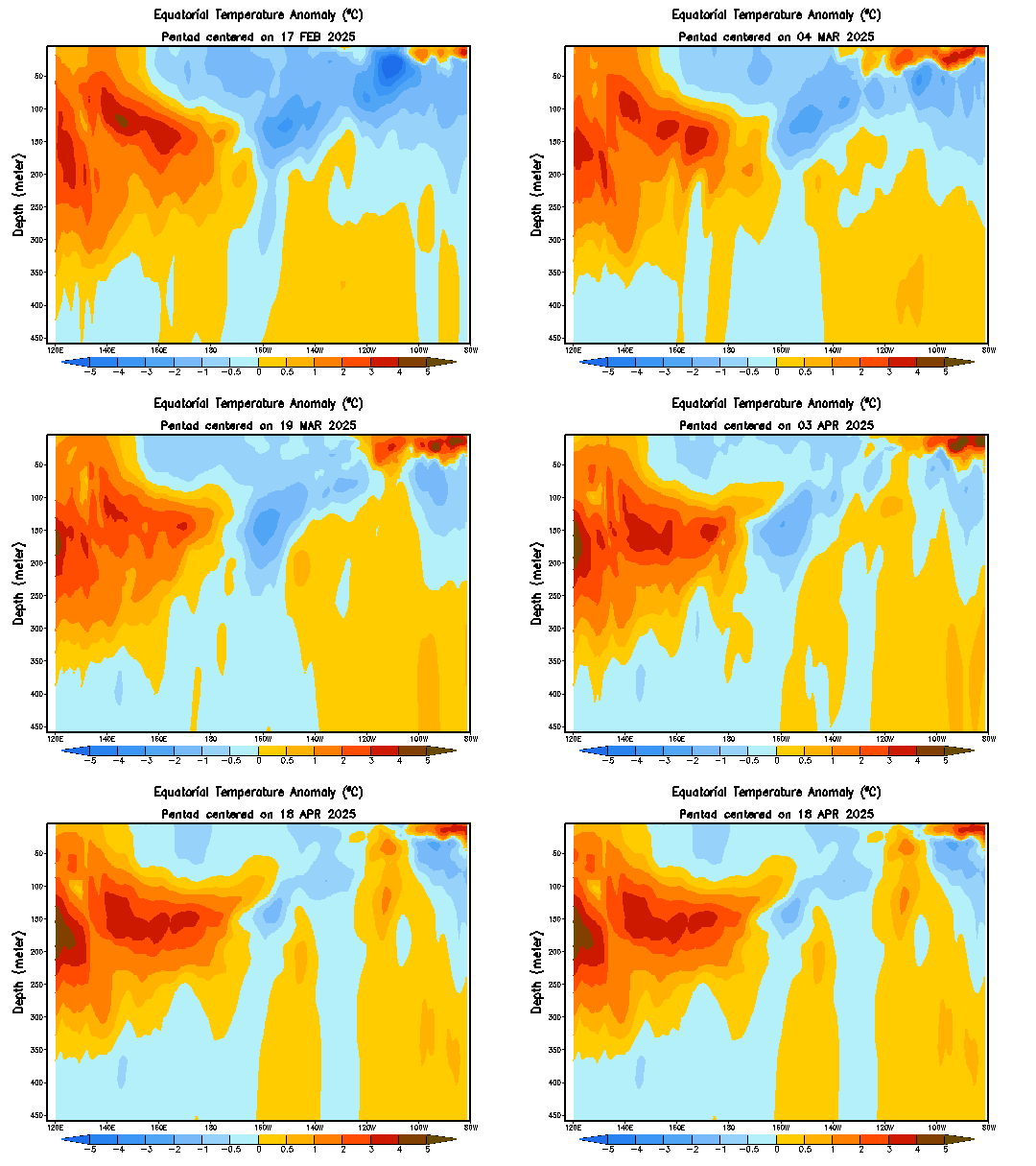
Equatorial temperature anomalies (top) and observed nominal temperatures (bottom) as of May 18th.
Source: CPC
Viewing sea temperature anomalies along the Equator as a function of depth can prove massively beneficial to forecasting abilities, as it can enable the forecaster to identify an area of well-below-normal anomalies right below the surface that is eating away at above-normal SSTs on the surface. In this hypothetical, someone only viewing the surface map would think there's a solid El Nino in place, but the forecaster with the depth map as well can see that the El Nino is actually about to dissolve.

Turning back to actual data, the depth chart above shows a broad expanse of above-normal water temperatures extending from 140º East to about 120º West longitudinally, with the positive anomalies reaching a depth of almost 150 meters in the western portion of this swath. However, when reaching the 120º-100º West longitude area, well-below-normal temperature anomalies appear, and seem to be threatening the warmer anomalies located at the surface. We can view an animation of this depth map to see how these two opposing bodies of water have been interacting lately.

Sea temperature anomalies by depth, animated. Refresh the page if the animation stops looping.
Source: CPC
Indeed, when viewing the animation we are able to grasp the rather-dire situation the ongoing El Nino seems to be in. After covering almost the entire Equatorial Pacific with well-above-normal temperature anomalies from the surface to almost 150 meters down in March, cooler than normal waters have gradually grown between 150 meters and 250 meters below the surface since then and have materially weakened the formerly-stout positive temperature anomalies below the surface. Even more concerningly for the El Nino, the negative temperature anomalies appear to be growing and deepening east of the 120º West line of longitude, suggesting that the positive SST anomalies in that vicinity may be at risk of dissolving in coming weeks.

We have the ability to determine if this is likely to happen.

Equatorial Pacific upper-ocean (through 300 meters) heat anomalies over the last year.
Source of graphic: CPC
Source of annotations: Author
El Nino and La Nina events can be driven by Equatorial Kelvin Waves, and whether the wave moving eastward along the Equatorial Pacific is upwelling or downwelling. If that sentence made you raise an eyebrow, you're most likely not alone. I can assure you, though it's actually pretty simple to understand. Let's break it down.

The phrase 'Equatorial Kelvin Wave' seems intimidating, so for our purposes here all we need to know is that, from time to time, these Equatorial Kelvin waves develop in the western part of the Equatorial Pacific and gradually move eastward along the Equator. When they move eastward along the Equator, they can be either 'downwelling' or 'upwelling' waves.
Consider the explanation of a 'downwelling' Equatorial Kelvin wave as described by the NOAA (read the full article here):

"Normally, winds blow from east to west across the tropical Pacific, which piles up warm water in the western Pacific. A weakening of these winds starts the surface layer of water cascading eastward..."

In other words, if this wind pattern that blows winds from east to west breaks down, that warmer than normal water begins pushing eastward along the Equatorial Pacific. This anomalously warm water works its way eastward gradually and tends to sustain itself in the process. As a consequence, downwelling Equatorial Kelvin waves tend to be associated with El Nino events. You can see my annotations of downwelling Kelvin waves as solid lines on the above image.
On the flip side, an 'upwelling' Equatorial Kelvin wave can be thought of as the ocean waters trying to get itself a little more in balance in the wake of this very warm downwelling wave. Thus, an upwelling wave again features a Kelvin wave slowly progressing eastward, but this time it cools down the upper-ocean waters to a degree that upwelling Kelvin waves are generally associated more with La Nina events. In the above image, I've made an attempt to outline upwelling Kelvin waves by the dashed lines.

Given that we've had three clear downwelling Equatorial Kelvin waves traversing the Equatorial Pacific over the last year, as outlined on the above image, it's not necessarily a shock that we are in an El Nino at this time. In addition, we are able to use the above image to see that the emergence of cooler than normal water temperatures in the eastern equatorial Pacific appear to be the result of an upwelling equatorial Kelvin wave, as shown by the dashed line at around 110º West longitude.

I want to point out something that could endanger the El Nino by the time we reach late summer/early fall, however. Referring back to the above image, note how an area of cooler than normal water temperatures have developed between longitude lines 130º E and 160º E. I've circled this swath for two reasons: because it is a rather expansive area of cooler waters relative to previous below-normal anomalies in the other two more-apparent upwelling Kelvin wave episodes, and because it has brought about the strongest negative temperature anomalies in that portion of the equatorial Pacific in at least a year. The risk here is that this is the beginning of another upwelling equatorial Kelvin wave, which will move eastward with time and bring those below-normal temperature anomalies to the Nino regions. Should this occur (and it is not a certainty yet), it could endanger the El Nino, which is already in a more fragile position as a consequence of the existing sub-surface below-normal water temperature anomalies. We will have to monitor this in the coming weeks to see if it is indeed an upwelling Kelvin wave or merely an isolated area of cooler waters in the western equatorial Pacific.

As discussed, however, even if this is not an upwelling Kelvin wave beginning to form, there has been a material change in the ENSO phenomenon as of late that necessitates discussion.

Upper-ocean heat anomalies in degrees Celsius between 180º and 100º West longitude.
Source: CPC
The Climate Prediction Center has allowed us to compile those same anomalies shown in the previous image into a single graphic. This chart shows upper-ocean heat anomalies (in degrees Celsius) between the longitude lines of 180º and 100º West, from the surface to 300 meters down, if I recall correctly. In the presence of an El Nino, these anomalies should be positive, while a La Nina should bring these anomalies into negative territory.

During the month of May, we have seen a drastic shift in upper ocean heat anomalies, although in reality this shift began in mid-March. Indeed, after peaking at 1.5º C above-normal in the middle of March, those positive anomalies rapidly declined, to the point that they're now just barely in below-normal territory. The negative anomalies aren't strong enough to point to a La Nina, but the change from strongly positive values to marginally negative values is not a trivial one.

What does it mean? It's a good view of the evaporating above-normal temperature anomalies below the surface of the equatorial Pacific that we discussed earlier. The negative anomalies are likely a bit overdone and not reflective of the true nature of the ENSO phenomenon, given that there is a small yet significant area of below-normal anomalies around the 120º West line of longitude that is most likely distorting this graphic to the downside. As such, while the degradation in positive anomalies is accurate and noteworthy, the recent move into negative territory doesn't seem to be precise in my eyes.

Temperature anomalies between 2º North and 2º South latitude at the subsurface depths of 55 meters (left), 105 meters (center) and 155 meters (right).
Source: CPC
We are able to again see this material deterioration in the El Nino by looking at temperature anomalies along the Equatorial Pacific at three different depths: 55 meters, 105 meters and 155 meters below the surface. The 55-meter chart on the left shows the recent resurgence in below-normal temperature anomalies, erasing the above-normal anomalies that were in place as recently as late April. The 105-meter chart in the middle gives a better look at the underlying trend - indeed, steadfast positive temperature anomalies between 150º East and the dateline have deteriorated since late April, not to mention the elimination of well-above-normal anomalies centered around the 130º West line of longitude.
Perhaps most alarmingly for the viability of the El Nino, the positive temperature anomalies at a depth of 155 meters (right) have completely disappeared and have instead been replaced by marginally below-normal anomalies ever since late March. The lack of a solid underwater base for the El Nino does not bode well for its survival into fall and winter, especially if that aforementioned swath of colder than normal waters around the space between longitude lines 130º E and 160º E does turn out to be another upwelling Kelvin wave. Only time will tell, but this will certainly be something to watch as we move into the fall months.

We've analyzed a lot of observed data for the ENSO phenomenon, but scientists have put in a lot of hard work to create climate models that can anticipate the state of the phenomenon down the road. Let's take a look at these forecasts.

IRI/CPC suite of forecasts for SST anomalies in the Nino 3.4 region.
Source: IRI of Columbia University
There are two graphics of model guidance I want to go over. The first comes courtesy of Columbia University, and depicts a variety of weather models' forecast for sea surface temperature anomalies in the Nino 3.4 region from now until the January-February-March period of 2020. As stated at the start of this post, however we will only discuss forecasts going into November and December, as model guidance begins to diverge too much for my liking beyond that period.

Model guidance is in pretty good agreement on keeping the El Nino around through at least the August-September-October (ASO) period, with one or two outliers both to the upside and downside of the consensus. Beyond that period, however, divergence increases, although a general theme through the November-December-January period is that positive SST anomalies appear probable, especially relative to the potential for negative anomalies. It is worth making mention, however, of a cluster of models that prefer taking the Nino 3.4 SST anomalies into a level below +0.5º Celsius but above zero, a neutral-ENSO scenario. For now, though, we will side with guidance that prefers a weak El Nino through the fall months.

NMME suite of forecasts for SST anomalies in Nino region 3.4.
Source: CPC
The NMME suite incorporates many of the models used in the IRI/CPC suite, but is worth going over anyway because of its variance with the first contingent of models analyzed. While this group of models foresees the El Nino as likely to persist into August, it seems as though there is a higher chance of SST anomalies dipping into the 0.0º through +0.5º region, not high enough to merit an El Nino classification but again more likely to exhibit El Nino conditions as opposed to La Nina conditions. Beyond September, though guidance diverges too much to gather an accurate forecast.

To Summarize:
- An El Nino is currently in place, with an El Nino Advisory declared by the Climate Prediction Center.
- Recent sea temperature anomalies below the surface suggest the El Nino may be undergoing a material degradation, potentially posing a threat to the survival of the phenomenon through the fall and early winter.
- Despite the apparent threats to the El Nino, model guidance sees the El Nino continuing into the fall months and perhaps into early winter. Beyond then, however, guidance diverges too much to ascertain what will transpire into the heart of winter 2019-2020.

Andrew

Monday, August 18, 2014

Modoki El Nino Gaining Control; Winter Outlook Grows Colder

It appears that a Central-Based, or Modoki El Nino is now gaining control, resulting in the outlook for this winter growing colder.

JAMSTEC
Click to enlarge
The image above, provided by the JAMSTEC agency, shows typical sea surface temperature anomalies during a Modoki El Nino. The presence of this Modoki Nino is clearly shown by the positive anomalies in the central portion of the Pacific, hence the interchangeability between Modoki and Central-Based El Nino. During the Modoki Nino, cooler than normal SST anomalies tend to appear offshore Ecuador, something we'll discuss a little later in this post. Looking towards the north Pacific, predominantly warm SST anomalies are observed, from the Sea of Japan, to the Bering Sea, to the Gulf of Alaska. Warm water anomalies are also recorded near Baja California.
Out in the Atlantic, warmer than normal waters surround Greenland and are placed into western Europe, with cool water providing a separation between that mass of warmth, and the second body of warm water juxtaposed near the Canadian Maritimes. The Indian Ocean also exhibits a slightly negative Indian Ocean Dipole signal (identified by cold water near Somalia and warm water near India) during Modoki El Ninos.

Let's now compare this typical  Modoki set-up with today's SST anomalies.

ESRL
Click to enlarge
Taking a look around the globe, we can identify several points of interest and discussion when comparing the Modoki composite image, and the daily SST anomalies from August 17th. Beginning in the Pacific, we see warm water anomalies off the coast of Ecuador, and cool anomalies in the central Pacific, basically opposite of a Modoki set-up. We'll dive deeper into that a little later in this post. Moving up to the North Pacific, we observe a swath of warmer than normal water temperatures in the Northeast Pacific/Gulf of Alaska, nearly identical to the anomalies seen during a Modoki Nino. The comparison is once again similar when we confirm warmer than normal waters stationed off Baja California, as also seen in the composite image. The Sea of Japan was well above normal earlier this week, as it is during typical Modoki El Nino events, but has since cooled due to the passage of Typhoon Halong over that area.
Transitioning to the Atlantic, additional similarities are found. We can see the warmer than normal waters near Greenland, pushing east into western Europe, as was also found in the Modoki composite image. There isn't much of a cold pool of water just south of Greenland, but warmth is observed near the Canadian Maritimes. The Indian Ocean is also displaying the same negative IOD pattern observed in a typical Modoki El Nino event.

Now, all of these similarities are impressive, but what about the El Nino itself in the Pacific? It looks nonexistent- actually opposite, of what the Modoki composite image shows us.

CPC
Refresh page if animation stops looping
The animation above shows us water temperature anomalies, the same variable examined earlier in this post, but now analyzed on a depth chart. The legend on the left displays depth in meters along the Equator, while the bottom legend indicates longitude lines. Looking over the animation, we can see that opposite pattern of cool waters in the central Pacific (top-middle of animation) and warm waters in the eastern Pacific (top-right of animation), but what is stirring below is even more interesting. We find a body of cold water pushing to the surface in the eastern Pacific, as well as a swath of positive water temperature anomalies manifesting itself below the surface in the central Pacific. Put two and two together, and the Modoki signal in the Central Pacific is definitely present, just not at the surface yet.

Now that we have shown how the Modoki El Nino is nearly completely present in water temperature anomalies around the globe, let's talk about the effects it may have on the upcoming winter.

JAMSTEC
Click to enlarge
The graphic above displays worldwide temperature anomalies during a Modoki El Nino. As we can see, cold weather is typically observed in much of the Central US during a Modoki El Nino, while warmth prevails in the Western US. Slightly warmer than normal anomalies are also visible along the Eastern Seaboard.
What this tells us is that, at least for now, the risk of another cold winter in the Central US is rising, while a warm winter along the West and into Alaska is also becoming a real possibility. Those in the East may need to watch for a slightly warmer than normal winter.

Andrew