Showing posts with label Kelvin Wave. Show all posts

Friday, June 21, 2019

June ENSO Update: El Nino Increasingly In Danger for Fall and Winter

It seems to me that the El Nino is in increasing danger for its survivability during the fall and winter months, with a variety of recent observations suggesting the El Nino has weakened and that near- to medium-term prospects are similarly downbeat. Click on any image to enlarge it.

We first begin with a look at the latest sea surface temperature (SST) raw values and anomalies.

Observed sea surface temperatures (top panel) and SST anomalies (bottom panel) for the seven-day period centered on June 12th.
Source: CPC
The actual observed temperatures, as shown in the top panel, are arguably more pessimistic with regard to the current state of the El Nino than temperature anomalies reflect. Indeed, where the top panel seems to suggest a total erosion of warmer waters and a filling-in of cooler waters (which appears symptomatic of a La Nina), the anomalies in the bottom panel are more sanguine, reflecting aggregate-neutral anomalies from the western coast of Ecuador to about 130 degrees West longitude. To the west of that, a swath of above-normal SSTs reflect the presence of El Nino conditions in at least some part of the Equatorial Pacific. 

In other words, while sea surface temperature anomalies (SSTAs) are rather mixed in the eastern Equatorial Pacific, it certainly looks more like an El Nino than a La Nina, a relief for fans of winter weather in the eastern United States. Of course, it’s never as simple as merely viewing one or two pieces of data. This situation gets far more intricate. In fact, there’s four different regions of the Equatorial Pacific that each make the situation rather intricate.

The four regions used for monitoring the ENSO phenomenon.
Source: CPC
There are four different parts of the Equatorial Pacific that meteorologists monitor to determine the state of the El Nino-Southern Oscillation (ENSO), the phenomenon that defines an El Nino or La Nina. When these sea surface temperatures are above normal, we call it an 'El Nino' event. When these anomalies are below-normal, we call it a 'La Nina' event. While we monitor the entire Equatorial Pacific to analyze the ENSO phenomenon, these four primary "zones" are:

Nino 1+2. This is a small slice of the Pacific located between the Equator and the 10º South latitude line, extending from the far western tip of Peru to the 90º West longitude line.

Nino 3. This is a larger slice of the Equatorial Pacific which spans from 5º North to 5º South latitude lines, and from 90º West to 150º West longitude lines.

Nino 4. This is also a larger slice, and also extends between 5ºN and 5ºS on the latitude markers. For Nino 4, however, the space is spread by longitude from 150º West to about 160º East, crossing the dateline in the process.

Nino 3.4. This is the critical area to watch, and is typically viewed as the primary space with which to assess the state of the ENSO phenomenon. Spatially, it extends from 5ºN-5ºS latitudinally, and 120º West to 165º West longitudinally.

Why do we break this space up into four different pieces rather than just average out the sea surface temperature anomalies and call it a day? A number of scientists with far more knowledge and research than I have come to determine that there can be more than one type of El Nino - where typically El Nino's bring warmer than normal waters to the eastern Pacific, an "El Nino Modoki" event brings warm waters to the western Pacific, and cooler waters to the eastern Pacific. This is not a trivial difference, but for our purposes here, we won't dive into that topic. For now, the key is understanding there are four different regions in which we monitor the ENSO phenomenon, with the Nino 3.4 region broadly being of most importance.

Now that we have an understanding of the parts of the Equatorial Pacific that are most important when analyzing the state of the ENSO phenomenon, we can proceed on to other observational data as of late.

SST Anomalies over the last year for the four ENSO monitoring regions.
Source: CPC
When breaking down observed SST anomalies over the four ENSO regions for the past year, as in the image above, it’s clear that this El Nino event is not clean-cut across the board. In Nino region 4, anomalies were recently seen about 1 degree C, a level that has been breached a number of times over the last year and a pretty strong signal of an El Nino event being in place – at least for that region. In Nino region 3.4, while positive SSTAs have been consistently seen over the past year, they aren’t at the same magnitude as in region 4, with a recent peak at the end of May only barely reaching 1.0 degree C above normal. Still, with this region consistently exhibiting anomalies above +0.5 degrees C, this region is also indicative of an El Nino, even if the signal is not as strong as in region 4.

Continuing eastward, region 3 is where this analysis begins to run into some troubles. While the recent history of region 3 anomalies has been positive and mostly above +0.5 degrees C, this same region saw anomalies turn negative as recently as early September 2018, with most-recent readings looking to dip below +0.5 degrees C to possibly a four-month low. Again, anomalies in this region have been pretty consistent in remaining above the +0.5 degree C level, which tells us an El Nino seems to be present. But the last year has shown anomalies that aren’t as stable as those seen in the last few months, which (at the very least) informs us that the current El Nino seems less established in eastern Eqautorial Pacific waters as compared to waters further west. Indeed, moving to Nino 1+2, this concept is confirmed. Anomalies are only now beginning to exit marginally-negative levels in this region, anomalies on a magnitude that set a ~10 month low earlier this month. Nino 1+2 seems to be more reflective of an ENSO-neutral set-up as opposed to the El Nino environment portrayed by the other three ENSO monitoring regions.

So far, we’ve established that there is indeed an El Nino present as per sea surface temperature anomalies. This is nothing new; the Climate Prediction Center has maintained an El Nino Advisory for some time now to reflect this. Let’s now turn to convective anomalies along the Equatorial Pacific and discuss something called the Walker Circulation.

If you’ve learned about the weather to some degree, you’ll know that a critical component to meteorology in the aggregate is the concept of heat transport. Whether it’s certain large-scale circulations like the Walker Circulation or Hadley Cell, or smaller-scale but still significant features like Rossby Waves or Kelvin Waves, the atmosphere has a plethora of ways by which it moves heat around the planet. Here, we’ll discuss the Walker Circulation.

Typical Walker Circulation pattern in a La Nina.
Source: Wikipedia
The Walker Circulation, in a nutshell, is an atmospheric circulation along the Equatorial Pacific that is closely intertwined with the ENSO phenomenon. Indeed, the ENSO phenomenon itself is a consequence (and, to a degree, an instigator) of heat transport in the atmosphere and in the ocean. The Walker Circulation changes with regard to longitudinal position of rising and sinking air depending on the state of the ENSO phenomenon, but the constant is that it involves an area of rising air, movement aloft of this air either to the west or to the east, and subsequent sinking air back to the surface before it moves either west or east (opposite the direction the air moved when it was aloft) back to the starting point to create that ‘circulation’ feature. 

The image above shows the Walker Circulation in a La Nina event as an example of how the circulation works. How can we tell this is a La Nina orientation of the Walker Circulation (aside from it being given by accessing the image)? Note the above-normal water temperatures in the far western Equatorial Pacific, just offshore Australia. This prompts convective activity, which sends warm air aloft. The air then travels to the east before cooling and then sinking over the waters just offshore of Peru. This sinking motion discourages thunderstorm development by suppressing air from rising. This air hits the surface of the water offshore Peru, and easterly surface winds transport that air back to where it started, just offshore of Australia. As a consequence of those easterly surface winds, water “piles up” offshore of Australia, a consequence of those surface winds pushing the water up against land. My favorite comparison to this phenomenon comes from the University of British Columbia where the author compares this “piling up” of water to someone in a bathtub blowing air towards the other end of the bathtub. In this scenario, the water is pushed to the other side of the bathtub and “piles up” there as well – albeit on a far smaller scale. To be sure, the actual piling up of water in the western Pacific from a La Nina Walker Circulation is also very small relative to the depth of the ocean, but it is still noticeable enough to address it. 

Let’s use observational data now to see if we can identify how the Walker Circulation is acting, to try and ascertain if the atmosphere is joining sea surface temperatures in signaling the presence of an El Nino.

OLR Anomalies over the Tropical Pacific from May 23rd through June 17th.
Source: CPC
The image above is titled with a strange acronym – “OLR”. OLR stands for Outgoing Longwave Radiation, and while much smarter people with much more research can provide a much better interpretation of it, for the purposes of this post we only need to understand how it relates to convection. Negative values of OLR correspond to increased convective activity, while positive values of OLR correspond to suppressed convective activity. Therefore, rising air / thunderstorms in the above image are shown by cooler colors, while sinking air / suppressed convective activity is shown by warmer colors.

Taking a gander at the above image, enhanced convection is seen across a good chunk of the Equatorial Pacific, namely between the longitude lines of about 150 degrees East to 150 degrees West. In contrast, broadly neutral to slightly positive OLR anomalies are seen east of the aforementioned area, extending all the way to the western coasts of Peru and Ecuador. With regard to the Walker Circulation, it seems as though the area of rising air is located east of Papua New Guinea, with that air then transported to the east and allowed to sink over the waters west of Ecuador. The surface winds would then appear to transport that wind to the west, completing the circulation. 

The only problem here is, this sort of circulation resembles the Walker Circulation in a La Nina, not an El Nino. In other words, if the Walker Circulation really is oriented like the paragraph above describes, water temperatures may support an El Nino but the atmosphere is more supportive of a La Nina.

Observed 200-millibar vector winds from May 23rd through June 17th.
Source: ESRL

Observed surface wind vectors from May 23rd through June 17th.
Source: ESRL
We can identify what the Walker Circulation is doing by checking out some composites of atmospheric variables as of late. For the benefit of comparison, I will view these variables using the same timeframe presented in the OLR graphic of May 23rd to June 17th. 

The top image above shows mean 200-millibar winds over the Tropical Pacific basin for this timeframe. In this graphic, we see the wind vector arrows looking like they’re ‘blossoming out’ away from a center point roughly located along the 180 degree line of longitude. This is called divergence, and represents air rising and then spreading out aloft. In severe weather, divergence aloft is crucial to sustaining thunderstorms, and the process is no different here. It is also no coincidence that the divergence aloft is juxtaposed with observed enhanced convection over roughly the same area – if there was convergence aloft and those arrows pointed in towards each other, convection would be suppressed. After the air rises east of Papua New Guinea, it has been transported to the east as shown in the graphic, before those vector arrows seem to converge at around the 120 or 130 degree West line of longitude along the Equator. This is that convergence phenomenon I just discussed, and represents air aloft that is coming together and now sinking.

After the air sinks back towards the surface, the second panel allows us to see how surface winds have been behaving over this ~month timeframe beginning in late May. After reaching the surface at around the 120 degree West line of longitude, surface winds have sent this air to the west and back to the starting point at about the 180 degree line of longitude, where the circulation starts over again.

In summary, over the last month the Walker Circulation has seen convection / rising air over about the 180 degree line of longitude, with the air then transported to the east aloft before converging and sinking at roughly the 120-130 West line of longitude. Once back at the surface, this air has been transported to the west back to its starting point, completing the circulation. Is this representative of an El Nino or La Nina? Let’s view the two Walker Circulation composites for each situation below.

Typical Walker Circulation cells in an El Nino state, with shading indicating SST anomalies.
Source: UBC

Typical Walker Circulation cells in a La Nina state, with shading indicating SST anomalies.
Source: UBC
When comparing the above two Walker Circulation composites for the two ENSO states to what was described / observed above, the circulation observed over the last month doesn’t line up exactly with either image. Looking solely at the recent flow aloft and comparing it to the above two images, the recent Walker Circulation has certainly been more akin to that seen in a La Nina. As both the La Nina image above and the recently observed flow show, upper-level winds are shown to be moving eastward after the 180 degree longitude line, and move westward over the waters offshore of Peru and Ecuador. This same pattern is shown in the La Nina image above, while the opposite is shown in the El Nino composite. At the surface, winds also reflect a La Nina pattern to some degree, with westward winds both observed and shown in the La Nina composite west of the 130 degree West longitude line, but observed winds are still easterly from the 130 degree West line of longitude to the coast of Ecuador, opposite of what a La Nina would see for that area. Also posing trouble in our interpretation of the state of the Walker Circulation is that observed areas of enhanced and suppressed convection don’t really line up with either composite graphic precisely, and again only seem to “lean” more towards a La Nina than an El Nino Walker Circulation. 

What do we then gather from all of this? Based on the behavior of the Walker Circulation, it seems that the atmosphere is more reflective of a La Nina than it is of an El Nino, in contrast to observed SST anomalies which promote a solid El Nino. This can be confirmed by viewing the Southern Oscillation Index (SOI), which has been seen at weakly-negative values (indicative of an El Nino) but also seen as “consistently near zero”, perhaps quantifying the somewhat-murky atmospheric features described above.

Recent history of the Southern Oscillation Index (SOI).
Source: BOM
So, we’ve got oceanic temperatures which are in favor of an El Nino, and atmospheric patterns which are broadly more akin to a La Nina than an El Nino. To try and remedy this discrepancy, we now look to the behavior of water temperatures in the Pacific basin below the surface.

Upper-ocean heat anomalies along the Equator.
Source: CPC
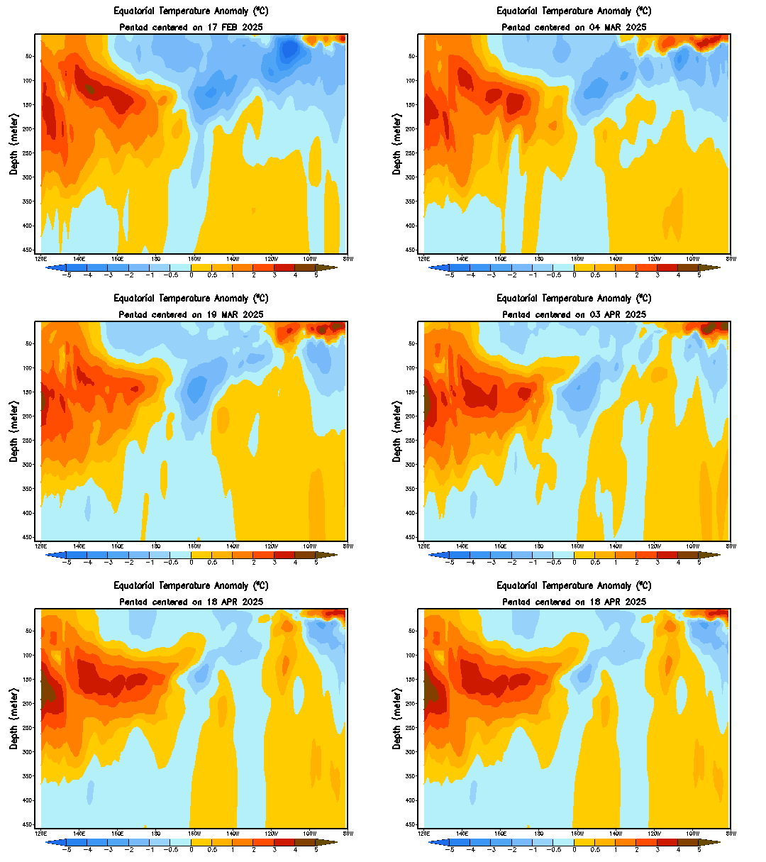
El Nino and La Nina events can be driven by Equatorial Kelvin Waves, and whether the wave moving eastward along the Equatorial Pacific is upwelling or downwelling. If that sentence made you raise an eyebrow, you're most likely not alone. I can assure you, though, it's actually pretty simple to understand. Let's break it down.

The phrase 'Equatorial Kelvin Wave' seems intimidating, so for our purposes here all we need to know is that, from time to time, these Equatorial Kelvin waves develop in the western part of the Equatorial Pacific and gradually move eastward along the Equator. When they move eastward along the Equator, they can be either 'downwelling' or 'upwelling' waves.
Consider the explanation of a 'downwelling' Equatorial Kelvin wave as described by the NOAA:

"Normally, winds blow from east to west across the tropical Pacific, which piles up warm water in the western Pacific. A weakening of these winds starts the surface layer of water cascading eastward..."

In other words, if this wind pattern that blows winds from east to west breaks down, that warmer than normal water begins pushing eastward along the Equatorial Pacific. This anomalously warm water works its way eastward gradually and tends to sustain itself in the process. As a consequence, downwelling Equatorial Kelvin waves tend to be associated with El Nino events. You can see my annotations of downwelling Kelvin waves as solid lines on the above image.

On the flip side, an 'upwelling' Equatorial Kelvin wave can be thought of as the ocean waters trying to get itself a little more in balance in the wake of this very warm downwelling wave. Thus, an upwelling wave again features a Kelvin wave slowly progressing eastward, but this time it cools down the upper-ocean waters to a degree that upwelling Kelvin waves are generally associated more with La Nina events. I’ve made an attempt to outline downwelling Kelvin Waves with gray lines, and upwelling Kelvin Waves with dark blue lines in the image above.

---

Over the last year, we have seen several instances where warmer than normal waters traverse the Equatorial Pacific, as shown by the streaks of warmer colors. I’ve annotated these as downwelling Kelvin Waves. We have also seen a couple instances where either the warmer than normal anomalies subside in an eastward-moving fashion, or the anomalies outright flip to below-normal levels. I have highlighted these as upwelling Kelvin Waves in the above graphic. There are a couple items in particular I want to discuss with regards to the graphic.

First is how the recent downwelling waves seem to have been weaker with each iteration since a strong one traversed the basin beginning in late September 2018. With the exception of the wave which eventually strengthened significantly in March, recent downwelling waves have proved underwhelming. This poses a risk to the sustainability of the El Nino, as weaker downwelling waves make the El Nino more vulnerable to a deterioration to neutral-ENSO conditions, or even marginal La Nina conditions, especially if a strong upwelling wave propagates through with the atmosphere already unconvinced over the presence of an El Nino.

Second is how the far western Pacific has become increasingly cooler over the last several months. Indeed, anomalies on the order of between -1 and -1.5 degrees C have most recently been spotted right at the 150 degree East line of longitude, which marks the coldest anomalies over that part of the basin in at least a full calendar year. If this is the start of another upwelling Kelvin Wave and these deeper negative anomalies sustain themselves, there is a risk that the El Nino takes a severe hit in SSTAs, perhaps threatening its sustainability into the fall and winter months.

Model guidance for the Nino 3.4 region sea surface temperature anomalies.
Source: CPC
Seasonal model guidance is picking up on the increasingly-fragile El Nino. Where there is a good deal of spread between the individual model solutions in the above graphic, the general framework sees the Nino 3.4 region warming slightly this month into next before weakening through the fall, with a modest recovery back into weak-El Nino territory for the winter months. These models have a number of ensemble members of their own, which can all be tracked on a single image. As you might imagine, that image is very messy and does more harm than good in my opinion with regard to trying to explain what’s going on, hence why I’m not posting it here. However, I can tell you that the suite of ensembles and models show quite a spread in the forecast, implying substantial uncertainty over how the El Nino will evolve in the coming months. There is, of course, always uncertainty in these kinds of forecasts, but even for only a two-month forecast, the variation in ensemble forecasts for Nino 3.4 anomalies is from about -0.7 degrees C to about +1.75 degrees C. By December’s forecast, that variation blows out to a range of about -1.0 degrees C to more than +2.5 degrees C. The variation speaks to model uncertainty over how the El Nino will transpire over the next several months, including questions as to if it will be able to survive in what could be a hostile environment.


To Summarize:
- Current oceanic conditions indicate the presence of an El Nino, with warmer than normal SSTs present across most of the ENSO monitoring regions.
- Atmospheric conditions are more ambiguous, appearing more in line with vaguely-La Nina conditions as opposed to El Nino conditions.
- Further weakening of the El Nino appears likely moving into late summer and fall, which could bring the survival of the El Nino into question. 
- For the time being, it seems prudent to continue with the assumption of a weak El Nino moving into fall and early winter, but close monitoring is needed over the coming months as the El Nino is increasingly fragile.


Andrew

Sunday, September 14, 2014

SOI Continues To Plummet As El Nino Emerges

The Southern Oscillation Index, a key indicator for the emergence of an El Nino or La Nina, continues to free-fall as our El Nino looks to finally come to the surface.

BOM
The image above shows a 30-day average of the SOI values from January 2012 to the present day. The Southern Oscillation Index is calculated by examining the pressure differences between Tahiti and Darwin, Australia. When values drop below -8, conditions are considered optimal for El Nino formation. Values above +8 are considered optimal for La Nina conditions.

 As the chart shows, we had been seeing predominantly-positive anomalies this past spring and early summer, which is likely a reason why the the historic Kelvin Wave never brought about the Super El Nino so many (myself included) had discussed. However, beginning right around the start of July, we saw SOI values tank, and they've remained below zero for the entire period since. Values have gone both above and below the El Nino 'benchmark' of -8 since that time, but have remained below zero the entire time.

Due to potential copyright infringement concerns, I will refrain from posting a forecast of the SOI I came across yesterday. What it shows, however, is continued negative SOI values for the next few weeks, and possibly beyond.

CPC
The animation above shows a depth-by-longitude animation of equatorial temperature anomalies, in Celsius, since mid-July to present day. In this animation, we see the Kelvin Wave-induced warm waters spreading east and pushing to the surface as they do so, now just beginning to hit the surface.

The SOI being negative indicates that trade winds along the Equator and areas in the neighborhood of the Central Pacific have shifted to a state that will allow this warmth to stay and ferment on the surface, likely into an El Nino. Back in April, with the historic Kelvin Wave warmth, trade winds wee unfavorable, and prohibited the warmth from sustaining itself on the surface.

In coming days and weeks, we'll likely see this winter's El Nino bring itself to the surface, likely at a weak, potentially moderate strength. I'll have more on the projected El Nino strength in the near future.

Andrew

Tuesday, July 15, 2014

2014-2015 Winter Forecast Update; Colder Outlook Now Favored

This post will examine the factors being analyzed for the upcoming winter, their impacts on the cold season, and anything that may have changed from the issuance of the Preliminary 2014-2015 Winter Forecast to today.

After going over the factors presented in our Preliminary winter forecast, and examining new data presented to me, I’m electing to favor a colder outlook to this winter, over the original warmer projection earlier this summer.

ESRL
The above image shows observed sea surface temperature anomalies across the globe from July 1, 2014, to July 8, 2014. In this image, we notice three particularly interesting features. One of these features is the pool of well above normal water temperatures in the Northeast Pacific into the Gulf of Alaska. This particular mechanism is one of substantial importance, given it also played a significant role in our last winter.

In the winter of 2013-2014, we had this warm pool present throughout the entire season, and it was quite possibly the most influential factor in making that winter as cold as it was. The warm water enabled strong high pressure to form over the Northeast Pacific, something that is continuing even to this day. See the examples below.
ESRL
The image above shows mid-level geopotential height anomalies in early January 2014. Cold colors indicate the presence of strong low pressure, hence below normal temperatures. The yellows and reds indicate high pressure, and warmer than normal weather. This image was recorded in the middle of the extreme cold spell that kicked off the new year, also spawning the ‘polar vortex’ hype. In this graphic, we can see the polar vortex located somewhere in south-central Canada, bringing that extreme cold to much of the United States. We also saw strong high pressure centered over Nova Scotia, and quite extensive high pressure from the Southwest United States to Alaska. It was this second body of high pressure that formed as a result of those aforementioned warm waters in the northeast Pacific, and we saw this ridge stay in place consistently throughout the winter. Now, with the warm waters in the Gulf of Alaska still in place a good year later, I am significantly concerned with the idea that we could see this extensive ridge forming yet again this coming winter.

Building off of this idea, in addition to the water temperature pattern in the Pacific going relatively unchanged since last winter, the upper air flow has remained relatively unchanged as a result.

Tropical Tidbits
This forecast image, valid on Monday, July 14, shows the same 500mb geopotential height concept that we saw earlier in this post, with blues indicating low pressure and reds indicating high pressure. In this forecast image, once again, we see strong high pressure stretching along the western coast of North America, with another body of high pressure being observed over Nova Scotia and far eastern Canada. And in a situation just like the polar vortex plunge last winter, we see anomalous low pressure crashing into the United States. This upper air pattern is almost (keyword almost) exactly like the one we saw last winter, bringing into question if we could see this pattern persist into next winter as well. In my opinion, if the sea surface temperature anomalies remain the same into next winter as they are now, I see no reason to discount the idea that the coming winter could be like last winter; a cold, potentially brutal one.

ESRL
Adding to the pieces of this puzzle is the body of significantly above normal temperature anomalies near Greenland. This is a change in what we saw from last winter. This past cold season, we observed primarily below-normal water temperatures near Greenland, resulting in some very stormy periods in the northern Atlantic. However, now that we’ve entered July, we now find ourselves with a formidable body of positive water temperature anomalies, something likely to change the game for the coming winter.

When warmer than normal water temperatures exist near Greenland, it provides a similar opportunity to that in the northeast Pacific, where high pressure can form. In this instance, high pressure can form over Greenland, and actually force the jet stream to buckle in the East US, resulting in an influx of colder than normal air to that area, as the image below shows.

NWS
 We didn’t have that warm water in place last year, meaning such a sequence of events couldn’t happen often, if at all. However, now that the anomalies have reversed, we’re in a much better position to see the jet stream buckle more frequently over the East US, resulting in another cold winter.

On a side note, we also see persistent above normal water temperatures near Nova Scotia, which could provide the mechanism needed to create high pressure in that area. This could then combine with the warm SSTs in the northeast Pacific to create an environment very similar to the one observed with the polar vortex incident.

DMI
We now continue on with a look at temperatures in the Arctic Circle. The graph above shows observed temperatures in Kelvin over the Arctic Circle (colored red), from the first day of 2014 to present day. We also see a green line, indicating the average Arctic Circle temperature for that given day, allowing us to compare with the observed temperatures to detect any anomalies. The consistent blue line highlights the freezing temperature mark. On this image, we see Arctic temperatures have been steadily below normal this summer, something that does not bode well for us in North America.

In order for winter to even be cold to begin with, one needs cold air. It seems simple to understand, but now we need to understand where this cold air will come from. By using this graph above, we can get an early glimpse at how much cold air the upper latitudes may be storing up for this winter. In this instance, below-normal Arctic temperatures in the summer might tell us to prepare for a cooler than normal winter ahead, while a warm Arctic summer could indicate a warmer winter ahead. Going by this guideline, we might be best off preparing for a chilly winter.

Now, last but definitely not least, we will go over the evolving situation in the Equatorial Pacific.
CPC
The image above shows equatorial upper-ocean heat anomalies, in Celsius. This means that the temperature anomaly for the upper portion of the Equatorial Pacific is calculated, giving a helpful indicator to the state of the El Nino-Southern Oscillation (ENSO) phenomenon. In this case, positive anomalies indicate the presence of warmer than normal waters, and potentially an El Nino. Similarly, below normal upper ocean heat anomalies highlight below normal water temperatures, potentially also the presence of a La Nina.

Looking at this graph over the past year, particularly since February 2014, we see that the upper ocean heat anomalies have skyrocketed, up to abut 2.0º Celsius above normal in late March 2014. It was at this time that we were expecting a strong El Nino to evolve for the coming winter. Things have certainly changed since then. The warm waters began to hit the surface this past spring, but couldn’t hold their ground, per se. As a result, we have seen the positive anomalies drop off to neutral territory, indicating that any possible El Nino no longer theoretically exists. Time will tell if we see another body of warmer than normal water temperatures pushing to the surface, possibly creating an El Nino. If that does not happen, we can expect the winter pattern to be dominated by more mesoscale (smaller-scale) features, such as the bodies of warm water temperatures in the northeast Pacific and around Greenland. This could then lead us into - you guessed it - a cold winter.

All of this is expected to change as we progress through summer and into fall; this is merely an update to the situation, since many things have changed since the initial issuance of our Preliminary 2014-2015 Winter Forecast.

Andrew

Friday, May 9, 2014

JMA Model Predicting Strong El Nino to Develop for Winter 2014-2015

The Japanese Meteorological Agency's long range climate model is predicting a strong El Nino to develop in time for the upcoming winter.


Shown above we see the predicted sea surface temperature (SST) anomalies in the yellow squares from present day to about October 2014, with observed SST anomalies in the red circles on the left side of the graph. We see that the JMA model is predicting a rather linear rise in sea surface temperature anomalies into this summer and fall, reaching El Nino territory by late spring. The shaded red region in this graph indicates the threshold and SST anomalies that define an El Nino (+0.5 degrees C or above), while the blue shaded region defines official La Nina SST anomalies (-0.5 degrees C or below).


The Climate Prediction Center (CPC) here in the United States makes its own climate model as well, named the Coupled Forecast System model (CFS). The CFS model above shows a linear increase in SST anomalies as well, maxing out at around 1.5 degrees Celsius for November-December-January in 2014-2015. The 1.5 degrees C above normal benchmark is also the threshold for a Strong El Nino, meaning such an El Nino of that strength is still possible (though in my personal opinion, not as likely). The general gist of these two models is that we can expect an El Nino to develop later on this summer, likely to strengthen through the fall and into this winter.

Andrew

Sunday, May 4, 2014

El Niño Beginning to Reach Surface

It looks like the much-anticipated El Nino is currently reaching the surface in the eastern Pacific.

Latest sea surface temperature anomalies (SSTAs) over the globe show our El Nino beginning to blossom in the sporadic areas in the waters west of Ecuador. This has been a long time coming, as we have been discussing extensively the Kelvin Wave that has been producing record-breaking temperature anomalies, as high as 6 to 7 degrees C above normal! The wave has been slow to push northward due to a not-as-favorable environment above the surface, but now that we are seeing the El Nino evolve, it can be expected that we will be in at least moderate El Nino territory by the time we hit late autumn.

Mean water temperatures along the equator from the surface to 500 meters down (top),
and anomalies for the same cross-section region (bottom).
If we take a look at sea surface temperature anomalies, now diagnosed on a cross-section along the equator from the surface to 500 meters down, it is evident that this Kelvin Wave-produced warm water is quickly upwelling to the surface. We see anomalies as high as 6 degrees C above normal about fifty meters below the surface, as is seen on the bottom panel in the top-right corner. As this body of warm water continues to push to the surface, we will likely see gradual weakening of these anomalies, but they should still be strong enough to propel us into our first El Nino event in multiple years.

Andrew

Wednesday, April 2, 2014

Record-Breaking Kelvin Wave Begins Hitting Ocean Surface

We continue to see the record breaking Kelvin Wave pushing to the surface, and anomalously warm waters are now appearing from the subsurface.

Water temperatures from the coast of Ecuador across the Equator are decidedly warmer than normal as of March 26th, as the chart above from the Climate Prediction Center shows. We see an arm of warmer than normal sea surface temperature anomalies (SSTAs) extending from about the 100W longitude line westward to roughly 140W. This noticeable warming comes as the strongest Kelvin Wave in history begins to push to the surface, in what could result in one of the stronger El Nino events on record.

The image here shows temperature anomalies on a depth by longitude layout on the bottom panel of this graphic, and the Kelvin Wave is clearly marked. As of March 31st, the water temperatures maxed out as high as 6.35 degrees Celsius above normal, confirming that this Kelvin Wave does appear to be the strongest one on record. This body of warm water provoked by the Wave is beginning to push to the surface, and this is already observed well by the extension of warm water to the surface around the 160E longitude line. I expect sea surface temperatures to continue to gradually rise in response to the agitated Kelvin Wave as it begins its trek to the surface.


We have been seeing the telltale El Nino signal in the Southern Oscillation Index for some time now. The chart above shows observed values of the Southern Oscillation Index averaged across a 30 day time period, shown since roughly December 2011. We have seen a roller-coaster pattern, as the atmosphere has been undecided on whether it will declare a La Nina or El Nino, until recently. As the chart shows, the SOI has completely tanked in recent days, to levels approaching -15. Values below -8 are considered resembling of an El Nino, while SOI observations above +8 are considered indicative of a La Nina. With the SOI being as low as it has been, there's little question in my mind that along with this Kelvin Wave, and taking into account the predicted conditions in the Equatorial Pacific in coming weeks, that we are entering into an El Nino.


A spread of global model projections of the El Nino-Southern Oscillation (ENSO) phenomenon all agree on at least a weak El Nino forming by August 2014, but even this seems a bit weak to me. I fear that model guidance is underestimating the current Kelvin Wave, and the El Nino may be a fair bit stronger by August 2014 than what is being shown here.

Updates on this unfolding situation will be provided on a weekly or bi-weekly basis, depending on the new information available.

Andrew

Saturday, March 22, 2014

Strong El Niño May Be Materializing Faster Than Predicted

The strong El Nino that was discussed in a recent post, where we analyzed the possibility of an El Nino that may rival the 'Super El Nino' event(s) of the past, may be forming now- far sooner than originally thought. Note: This post is an update to my previous post on the impending El Nino, which can be accessed by clicking here.

Let's refresh our memories about the El Nino-Southern Oscillation phenomenon.


The image above shows sea level anomalies associated with the El Nino phase of the El Nino-Southern Oscillation (ENSO) phenomenon, as well as the La Nina phase. As is shown, an El Nino sees substantially higher than normal sea levels in the eastern Equatorial Pacific, while a La Nina sees below normal sea level anomalies. In the same sense, an El Nino observes warmer than normal waters over those same areas, and a La Nina depicts colder than normal waters in the same blue and purple areas shown.


The image above shows observed values of the Southern Oscillation Index, also known as the SOI. The SOI is calculated by observing pressure differences between Darwin and Tahiti near the Equator. Negative values of the SOI, namely below -8, indicate the dominance of El Nino-like conditions, while positive values above +8 show the presence of La Nina conditions. This graph goes back to January 2012, when we began to see a consistent negative SOI values. However, we then returned to typical fluctuations of the SOI in 2013. It is only now, in March 2014, that we have observed an absolute crash of the SOI in recent days, well into definitive El Nino territory. This collapse of the SOI well into negative values tells me the atmosphere is priming itself for the onset of the El Nino that we discussed a few days back. We've known for a while that the El Nino is on the way, but the SOI crash indicating an El Nino arising is happening far faster than originally predicted. But how can we know this is an actual El Nino emerging, and not just your normal fluctuation of the SOI?

The graphic here shows water temperature anomalies by depth over the eastern Equatorial Pacific, more specifically from the 140E longitude line to the coast of Ecuador, right along the Equator. Let's take a look at the top panel of this graphic, which shows the anomalies by depth (the bottom panel shows temperatures by depth, not anomalies). What we see is quite startling- there is a body of extremely warm water just under the surface of the Equator, controlling the waters 100 meters to 200 meters below the surface.  This swath of warm water tells us that there is a Kelvin Wave afoot.


This graphic, drawn up by Mike Ventrice, shows the sort of situation we're experiencing with the Kelvin Wave. As the Kelvin Wave pushes east, we see sea level anomalies rise in conjunction with the anomalous warmth. Ahead of the Kelvin Wave, we then see downwelling, which lowers sea levels and cools sea surface temperatures, leading to a 'false Nina', where the SSTAs might tell us there's a La Nina, but it's actually just a byproduct of the Kelvin Wave beginning to push east. 

This Kelvin Wave has been sitting in the waters below the Equator for some time now, but it is only recently that we're seeing the Kelvin Wave actually start to impact the surface waters. We can see how this is happening, as the temperature anomaly by depth image above shows two arms of warmer than normal waters stretching from the Kelvin Wave up to the top of the image. It's no surprise that the Kelvin Wave is impacting the surface. What is surprising, though, is how fast this is happening- the formation of an El Nino was expected to be around a 2-4 month timeframe, but now we could be looking at formation in just a matter of weeks.


We're also seeing skyrocketing upper ocean heat anomalies, confirming the idea that this is a true El Nino, and not just some random SOI fluctuation or the odd, small body of warm water pushing to the surface.

A more startling feature of this phenomenon is, even though we're seeing the warm water push to the surface, the Kelvin Wave is getting stronger rather than weaker.

This image shows three panels of observed sea surface temperatures on March 20th. We see climatology of sea surface temperatures (SSTs) on the top panel, actual observed SSTs in the middle panel, and anomalies of the observed SSTs on the bottom panel. We're going to be focusing on the bottom panel, where we can see the full strength of the Kelvin Wave. If you go back to the Super El Nino post, we saw the last observation of the Kelvin Wave at abut +5.35º C above normal. However, this image shows how the Kelvin Wave has strengthened to +5.64º C above normal- a +0.29º C increase in just a week! When you take into account that the Kelvin Wave that produced the 1997 Super El Nino was only +4.3º C above normal at the same time as this image (in March of 1997), it looks like we might be looking at the strongest Kelvin Wave observed to date. This would help the idea that we're looking at a Strong El Nino to evolve in the next few months (or weeks depending on how fast the Kelvin Wave propagates to the surface).

All of this tells me we are looking at the El Nino arriving much sooner than first predicted. Rather than the original 2-4 month timeframe I had been planning, it's possible we see an El Nino in just 4 to 8 weeks. I wouldn't be surprised if we saw the emergence of a moderate El Nino in about 6-12 weeks from today, with a strong El Nino arising in as soon as 12-16 weeks. This may seem like a long time, but when you consider my original projection for a potential strong El Nino was after August 2014, this is certainly a much sooner projection, reflective of what the Kelvin Wave has been doing in the last week or so.

Impacts on the United States include a potentially more active severe weather season, which I will address in my 2014 Severe Weather Season Outlook, to be issued tomorrow (Sunday). We may also see a more suppressed hurricane season, and this will be addressed in my 2014 Atlantic Hurricane Season Outlook, which will come out later on in April.

Andrew

Sunday, March 16, 2014

Could The Next 'Super El Niño' Be Forming?

Today, we'll be addressing the idea on if the next 'Super El Nino' could be forming in coming months. But first, let's revisit the concept of an El Nino.


The image above shows sea level anomalies associated with the El Nino phase of the El Nino-Southern Oscillation (ENSO) phenomenon, as well as the La Nina phase. As is shown, an El Nino sees substantially higher than normal sea levels in the eastern Equatorial Pacific, while a La Nina sees below normal sea level anomalies. In the same sense, an El Nino observes warmer than normal waters over those same areas, and a La Nina depicts colder than normal waters in the same blue and purple areas shown.

Now that we've established the ENSO phenomenon, let's move on to the original 'Super El Nino' of 1997.

Beginning in the summer of 1997, we began to see rapid and extreme warming of the eastern Equatorial Pacific, defined hereafter as the Pacific waters along the equator east of the 180 degree longitude line. The above image, created by the NCEP/NCAR Reanalysis system, shows anomalous sea surface temperature anomalies in Celsius from November 1st, 1997 to December 31st, 1997 at the height of the El Nino event. We saw anomalies top 4 degrees Celsius above normal, as the contour line shows, indicative of a truly historic El Nino event. We also began to see a shift in the sea surface temperature pattern in the Northeast Pacific, as cooler than normal waters began to push northeast, making for a typical positive Pacific Decadal Oscillation (PDO) phase.


If we look at Oceanic Nino Index (ONI) values over the 1997 period, we see how the El Nino-Southern Oscillation (ENSO) began in a cool-neutral phase, where we see water temperatures that are cooler than normal, but not cool enough to be classified as a La Nina. This cool-neutral state rapidly eroded as we moved into March-April-May 1997, as we saw ONI values rise a handful of decimal places each month, before an official El Nino was declared in May 1997, as the ONI rose to +0.7 degrees Celsius, above the +0.5 degree threshold that defines an El Nino. From there, eastern Equatorial sea surface temperatures continued to rise at an alarming rate, as we entered Moderate El Nino territory in June 1997 with the emergence of sea surface temperature anomalies (SSTAs) above +1.0 degrees Celsius. Just one month later, in July 1997, a Strong El Nino event was declared, as SSTAs hit the +1.5 degree Celsius benchmark that defines a strong El Nino. It didn't stop there, however; the ONI continued to skyrocket until November 1997, when we hit the peak of the El Nino event with an ONI value of +2.4º Celsius, a record-breaking value up to that point in recorded history. Now, with climate models suggesting we're about to enter into a new El Nino, and new data indicating a strong El Nino is becoming increasingly likely, it's time to consider if we are about to dive headfirst into the next Super El Nino.

Let's begin by taking a look at sea surface temperatures and anomalies under the surface for the month of March. The graphic above shows three panels; the top panel shows the typical climatology of sea surface temperatures for the month of March, while the middle panel shows observed SSTs (not SSTAs, those would be anomalies; the second panel just shows the real observed temperatures in Celsius). What we want to pay attention to is the bottom panel, where we can see sea surface temperature anomalies in the Eastern Equatorial Pacific down to as low as 400 meters below the surface. What we see is startling- there is a massive body of warmer than normal water located 100 to 200 meters below the surface. An animation of subsurface anomalies confirms that not only do we have a historically strong warm body of water below the surface, but it's actually moving towards the surface.


This swath of warm water tells us that there is a Kelvin Wave afoot.


This graphic, drawn up by Mike Ventrice, shows the sort of situation we're experiencing with the Kelvin Wave. As the Kelvin Wave pushes east, we see sea level anomalies rise in conjunction with the anomalous warmth. Ahead of the Kelvin Wave, we then see downwelling, which lowers sea levels and cools sea surface temperatures, leading to a 'false Nina', where the SSTAs might tell us there's a La Nina, but it's actually just a byproduct of the Kelvin Wave beginning to push east.


The image here shows the anomalous depth of the 20 degree Celsius isotherm from the present until April 2013, about one year ago. This is a tool forecasters can use to determine what ENSO state we are in, or if there is a Kelvin Wave occurring. If we look at the anomalies since spring of 2013, we don't really see any anomalies present until July 2013, when we saw a weak Kelvin Wave push through. The cool-neutral ENSO state we were in is apparent by the slightly cooler than normal waters from April to July, but the whole scene changes in July. We saw two weak Kelvin Waves push through, as the two lines of warmer than normal waters show from July to October 2013. We then saw that sort of downwelling event prior to the next Kelvin Wave, with cooler than normal waters coming around in October 2013 before the next, stronger Kelvin Wave moved across the Pacific. Then, recently, as we moved into January 2014, we saw the strongest downwelling event in recent history, close to an actual La Nina, before this Kelvin Wave made itself known. As you can see in the image, this Kelvin Wave is the strongest one not only in this image, but even stronger than the Kelvin Wave that produced the 1997-1998 Super El Nino.

The image above shows the same three panels we discussed a few images ago, but now valid in March 1997. If we take a look at subsurface temperature anomalies, once again we see a very strong Kelvin Wave present 100 to 200 meters below the surface. This wave registered in at +4.3 degrees Celsius above normal, which doesn't even come close to the +5.4 degree Celsius anomaly we are currently observing, as the 2014 version of this three-panel image we analyzed earlier showed. Just based solely on the Kelvin Wave comparison, things are looking very supportive of a Super El Nino, or at least a general El Nino arising later on this year.

Something else we can use to analyze the state of the El Nino-Southern Oscillation (ENSO) phenomenon is the presence of anomalous lower level zonal winds across the Equatorial Pacific.

The image above shows past 850mb zonal wind anomalies from 5N to 5S on the latitude spectrum, covering the world on the longitude spectrum. What we're looking for in this image is the swath of above normal zonal winds between the 120E and 180 longitude demarcations, between February 17th and March 9th. During this timeframe, we observed anomalous westerly winds originating from the Indian Ocean and points just east, near Micronesia. These westerly winds are known better as westerly wind bursts (WWB), and are created when winds from low pressure systems north of the equator and winds from low pressure systems south of the equator combine to produce strong, eastward winds. These anomalous eastward winds herald the presence of an El Nino environment, as they assist in Kelvin Wave propagation, which then provokes an El Nino in some cases.

For a better explanation, take a look at the image I made above, illustrating the phenomenon. Low pressure systems have winds spinning counterclockwise, while low pressure systems south of the equator see winds spin clockwise. Near the equator, these winds can combine to make for strong westerly winds, which then show up on the time/longitude diagram we just analyzed as anomalous positive zonal wind values.

The image above shows a GFS forecast of 1000mb standard height anomalies with contours superimposed. If we look closely here, we see as many as four storm systems of concern. We see two compact, strong cyclones riding the 10S latitude line, one being northwest of Australia and the other northeast of the country. The third cyclone appears at the very top of the image, close to the 10N latitude line, north of the equator. There is also a fourth, stronger cyclone along the 10S line far to the east of Australia. What do all these storms mean? We can apply the diagram I drew up above this GFS forecast to this situation. The two cyclones immediately north of Australia and the cyclone at the top of the image have the potential to combine and make for another westerly wind burst (WWB), which would show up on diagrams as another swath of positive zonal wind anomalies. This forecast is valid for March 18th, and the hovmoller diagram (also known as the time/longitude diagram we analyzed two graphics above) supports this idea of another WWB event, showing westerly winds now centered at the 180 longitude line, a bit to the east of the previous WWB events in February. This eastward progression of the WWB events indicates even more support for an El Nino, and continuation of support for the Kelvin Wave currently sitting 100 to 200 meters below the surface.

The GFS only shows the westerly winds intensifying by March 22nd, with two very strong cyclones now present in the vicinity of Australia, and a strong cyclone still in place in the very top left corner of the image. This continues to tell me we're in for a pro-El Nino environment for the first time in several years.

Long range model guidance from Kyle MacRitchie indicate we will see negative outgoing longwave radiation (OLR, negative OLR values mean stormy weather) values continue to originate from the Indian Ocean region in the near future, only continuing to provoke WWB events and enhance the likelihood of not only an El Nino, but a strong El Nino/Super El Nino.

This graphic, showing OLR and 850mb wind forecasts for April 17, 2014 details how this pro-El Nino pattern is likely to continue into Spring, as we see negative OLR values continuing to push east, and westerly winds also continuing to push east, as is noted by the eastward pointing arrows.

The May forecast for these same variables shows even stronger negative OLR values in the Oceania region, with even stronger westerly 850mb winds. To me, this all spells a rapidly-forming El Nino, possibly coming about as quickly as May or June. That big Kelvin Wave just a hundred meters under the surface is pushing towards the surface, and if it does hit the surface before May, chances are great that we will see not only an El Nino form for the rest of this year, but it would likely be strong... as strong as a Super El Nino, potentially.

Even eerier than how strong this Kelvin Wave is, and how much the environment seems to be supporting at least a general El Nino (not to mention a Super El Nino), is how similar the westerly wind pattern in January-February-March 1997 is to the January-February-March pattern of 2014 (this year).


 Shown above is an anomaly chart of 850mb zonal winds from January 1st, 2014 to March 1st, 2014. We see a swath of positive zonal winds in the vicinity of Malaysia and areas just north of Australia, proving the idea of those westerly wind burst events. We also see a large swath of westerly winds across the northern Pacific and Atlantic, even down to the far southern Pacific near Antarctica. General negative zonal wind anomalies are observed in the Eastern Equatorial Pacific, as the atmosphere is not under an El Nino yet, and these negative anomalies extend into the Atlantic as well. Let's see how January-February-March 1997 matches up.

The comparison of 850mb zonal wind anomalies between January 1, 2014 to March 1, 2014 and January 1, 1997 to March 1, 1997 is stunning. Every single factor we outlined in the 2014 image above is present again in this 1997 image. We once again see the north Pacific strong westerly winds, the Atlantic westerly winds, the Oceania westerly winds, and even the long swath of anomalously high zonal winds in the southern Pacific near Antarctica. But it doesn't stop there- we see an almost perfectly-replicated placement of negative zonal wind anomalies in the Eastern Equatorial Pacific to the Atlantic. The environment today is extremely similar to the one in 1997. This only adds further to the increasing pile of evidence supporting not just an El Nino, but possibly a Super El Nino down the road.

So, what's causing all of this 'westerly wind' stuff, anyway? Is it just happening? The answer lies in yet another piece to this very intricate puzzle: the Madden-Julian Oscillation (MJO).

The image shown above was produced by Michael Ventrice, and shows a special view of the Madden-Julian Oscillation. For those unfamiliar with the concept, the Madden-Julian Oscillation involves the specific placement of enhanced or suppressed tropical convection along the equator. If the convection is enhanced in a certain area, it is put into a certain phase. In this instance, the MJO begins in Phase 1 with tropical convection enhanced just west of the subcontinent of India, and goes all the way out to Phase 8, which sees tropical convection placed far northeast of Australia, as the diagram below shows.

A phase by phase breakdown of each phase of the MJO, where blues indicate enhanced tropical convection,
and oranges show suppressed tropical convection.
Back to the phase space chart drawn up by Michael Ventrice, it is a specific graph. This MJO graph takes into account the El Nino Southern Oscillation phenomenon, which can produce its own enhanced or suppressed tropical convection, depending on which state (El Nino or La Nina) it is in. Additionally, the MJO is calculated based on 850mb zonal wind anomalies and their specific placement. In this case, you can switch out the negative OLR anomalies on the 8-panel graphic above for above normal zonal wind anomalies and you'll see a pretty good display of how the MJO can be calculated in that aspect. Now, the phase space shows the MJO back to December of 2013. Since then, we've seen an oscillation throughout all of the phases, but it's only been recently that we've seen a spike in MJO intensity, namely around Phases 7, 8, 1 and 2. These phases see enhanced tropical convection placed in and east of the Indian Ocean. This has led to multiple cyclones forming on either side of the equator, leading to, yes, the westerly wind burst phenomena. This forecast shows the MJO wanting to stay in the Phase 7, 8, 1 and 2 area, which would continue to form cyclones on either side of the equator to provoke additional WWB events, leading to a stronger pro-El Nino environment.

Now that we've well established that the atmosphere is really pushing for an El Nino, historically, how likely is an El Nino at this point?

Do not use without permission
I made a chart above showing a compilation of Oceanic Nino Index (ONI) values of a given year that began in either a La Nina state (values below -0.5º Celsius) or a Cool-Neutral ENSO state (values between 0.0º C to -0.5º C) that then turned into El Nino years down the road. The dashed line shows the latest forecast, using the NCEP CFS long range model. As you can see, most years shown here had a rather linear ENSO growth from Nina to Nino state. The general cross-over to El Nino territory was observed around April to May, with moderate to strong El Nino events usually becoming known around June or July. To be honest, based on the data presented here, this would not surprise me to see the dashed line forecast verify, or even be stronger than what it is shown to be.

Do not use without permission
I then created a graph showing La Nina or Cool-Neutral ENSO years that eventually became Strong El Nino (+1.5º Celsius anomaly or higher) years. Once again, we see a rather linear evolution of the El Nino, breaking into weak El Nino territory (+0.5º C to +1.0º C) around May of the given year, before hitting Strong El Nino territory around August or September of the year. Once again, the forecasted values are shown on the dashed line. I'm also thinking bullish on this forecast, in that we may see the El Nino stronger than what the dashed line forecast shows here. Regardless, the trend is clear- we are likely diving headfirst into an El Nino, if not a Strong/Super El Nino.

Based on all the data presented here, I feel we are well on our way to an El Nino. As for the question of if we break into Super El Nino territory, I'm definitely leaving it on the table, and I think it's a very real possibility. However, we will probably need another month or so to see just how great the chance of that is.

Andrew